A Design Classic demystified?
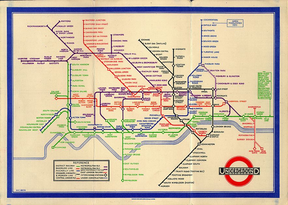
Mr. Beck’s London Tube map is a real design classic. Besides the timeless and universal design, the chosen geographical distortion has always been a point of discussion.
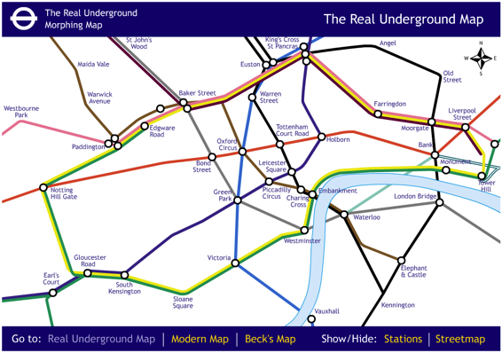
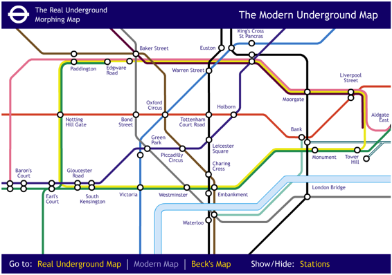
At fourthway [via infosthetics] we find a nice animation between the “real map”, which is geographically correct and the stylized map, which is optimized for reading and aesthetics.
At first glance, the very nice animation might give us the impression that Beck’s creation is really of no help as the geographically correct map is still nicely readable and gives us so much more insight of where we actually are or go.
So did Beck err, and we are being fooled by strange subway maps around the world for no reason? Certainly not!
The answer is quite simple. The clip the guys at fourthway use is a quite small part of London’s inner city. Thus the average distance between stations has a relatively small variance (and is small itself), and – as we see – it does not make much of a difference which version of the map we look at.
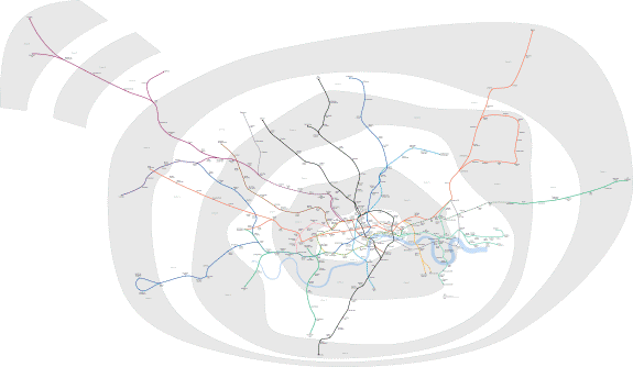
Taking the current complete map and shading the chosen clip in it, shows how much of the subway network is not covered:
I am too lazy now to get the real distances fixed, but only looking at the fare zones (as a proxy for distance) shows us that the clip covers mainly only fare zone one, and almost any line extends to at least zone 4, some even as far as 9.
The full story of a geographically correct London Tube map looks like this
and can be found at Wikimedia along with some more detailed maps.
Now it is very easy to understand why Mr. Beck really had a brilliant idea in choosing this particular design which was consequently adopted in subways around the world.
