Don’t call me “Marimekko”
This post on Junk Charts caught my attention. It is the mosaic plot version of the greenhouse gas chart which was initially a pie chart.
This is maybe one of the best counter examples for mosaic plots.
It is not hard to explain why a “traditional” mosaic plot completely fails to visualize this kind of data:
- there are eight levels for the second category
- many of the cells are (almost) not filled
- there are only two variables in the plot
- (there are no gaps between the variables)
In short, traditional mosaic plots work best when we want to visualize associations between a few categorical variables with few empty cells – to just display a “simple” table, variants of mosaic plots are definitely the better choice.
Let’s come back to the actual data in the example. Here is a screen shot of a Mondrian session showing two barcharts and a multiple barchart of the data:
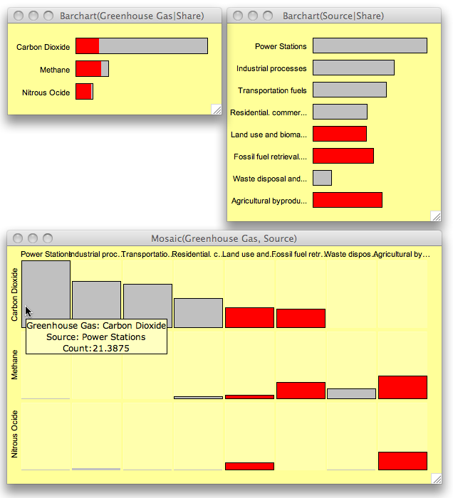
Whereas the sources are relatively uniformly distributed, the gases are clearly dominated by CO_2. Crossing the two variables reveals that half of the cells are empty, which is the reason why a mosaic plot has a hard time to show the data.
‘Source’ is sorted according to the absolute share of CO_2, such that the multiple barchart is easier to read. Looking at the three largest CO_2 sources we find that these categories make up exactly 50% of all greenhouse gas emissions in the data.
Only three sources (as highlighted) generate at least two kinds of gases in reasonable quantities.
It is always a good idea to discuss visualization ideas with real data which we actually want to analyze and understand – as with the greenhouse data here – and not just play around with artificial data as we find here and here. This seems also to be the source of the Marimekko …




I’d love to visualize an ‘assoziation’ if I knew what it was.
But I would settle for visualizing an association.
Hmm, dealing with too many languages the delta between words sometimes gets too small 😉