World Cup Aftermath
Now that the world cup is over, and we finally have a winner, it is time to compare the expected values with the real outcome – don’t mix this up with comparing the outcome we would have liked to see with the real outcome, which is often done in business analytics …
The expected values are taken from Leitner, Zeileis and Hornik’s paper on the chances to win the world cup. What is appealing in their approach is to look at the bookmaker’s quotes rather than at the more long term scores from FIFA or ELO.
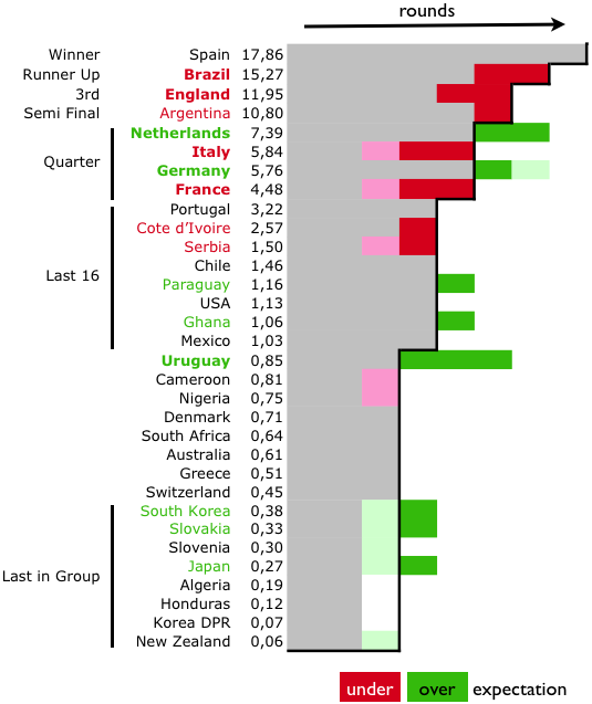
Here is a visualization ordered by the winning probabilities in %

When being ordered by the winning probabilities, the team ranked 1st should win the cup, number two should be the loser in the final, and so on. During the group stage all teams perform 3 games, but we assume the 8 smallest ranks to be the last in their group.
Given this ranking, we can visualize whether or not a team met the expectation or not. Teams falling short are indicated with red bars, i.e., stages they never reached, teams that performed above expectations extend with green bars.
What can we read from the graph? ITALY and FRANCE were the worst under-performer, as they did not only fall short of two stages, but they also ranked last within their groups. URUGUAY is clearly furthest above expectation as according to their rank, they were not even meant to advance to the last 16, but actually made it into the semi final.
What about SPAIN? Although they did win the cup, there was nothing really surprising given they were ranked 1st anyway.
Using the actual winning probabilities, we can also calculate what it actually took the teams to get to the point where they finally dropped out – that might probably rank them quite differently … but that will be another post.


