statistical graphics 101: Barcharts
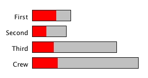
This month’s graphics is the Barchart. The barchart is used to visualize categorical data. It is often confused with the histogram, which can only be used if the data is continuous. The following barchart shows the distribution of all passengers of the Titanic according to their classes.

All passengers who survived are highlighted in red. As it is not an easy task to compare the proportions between the classes, one might want to switch to the Spineplot view. In a spineplot, the proportionality is exchanged between width and height, but the highlighting direction is kept the same.

In a spineplot it is a trivial task to compare the highlighting across categories.

In a spineplot it is a trivial task to compare the highlighting across categories.


