Blinded by Animation?
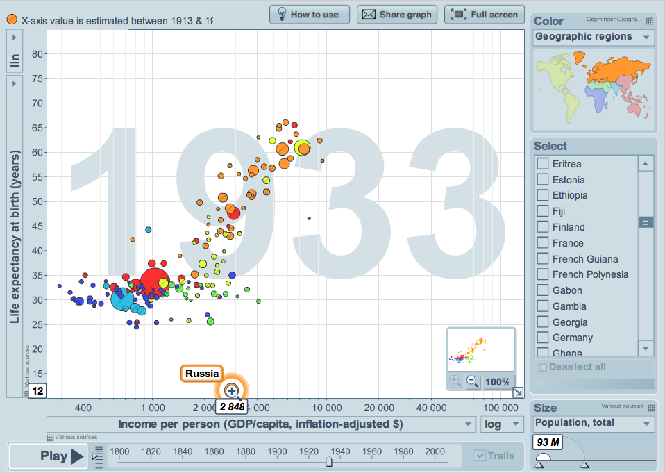
Stopping by at http://www.gapminder.org, you will easily get to the “default” example, which shows the scatterplot of life-expectancy vs. income-per-person running through the years 1800 to 2009.
You really have to look carefully to spot the problem with Russia in 1933. How do we explain a spontaneous drop of life-expectancy from 33 years to only 12 years? This is obviously an error, which was not fixed before the data was released.
It gets quite clear when you look at the time series itself, which you get when you select time to be the x-axis:
Apart from the drop in 1933, we also find strange data for the time of WWII. The war apparently has no effect on the life-expectancy at all. Hard to believe – but this data might just have been “optimized” by the political regime.
Once again time to remember Peter J. Huber’s words: “Never underestimate the rawness of raw data!”


The drop in 1933 may be due to the famine in Ukraine and Moldova (which were Soviet republics at that time), see http://en.wikipedia.org/wiki/Ukrainian_famine .
Hmmm, but 12 years is really pretty low. Even if parts of the Russian empire experience a dramatic drop, this may only result in a reduction of the overall expectancy of a few years.
Regarding WWII there simply was no data at all in the original dataset. (You can download all of them.)
The diplayed data are explained in the documentation:
“The Gapminder dataset for life expectancy at birth stretches over 200 years and contains
a) estimates of average life expectancy from different sources (see section 3)
b) where no estimates are available, a constructed, simple model for showing approximate levels and changes in historical life expectancy by country (see section 4)”
more: http://www.gapminder.org/documentation/documentation/GD004/Gapminder%20documentation%20004%20Life%20Expectancy%2020100528.pdf
addition:
it’s the same with 1896-1900 and 1900-1920.
1958-1970 has its data from another source.