EU Debt Crisis – What Crisis?
Following the news and trying to understand what is going on in the “EU debt crisis” is a hard job and maybe a good visualization can help. At first sight the BBC did it. Eurozone debt web: Who owes what to whom? shows nicely how the relation between the most “interesting” debtors and creditors in the EU (spiced up with the US and Japan) is.
There is also a short explanation to each country’s situation in relation to its GDP right of the graph, but that is full of interpretations and “insights” which hardly match with the figures in the graph.
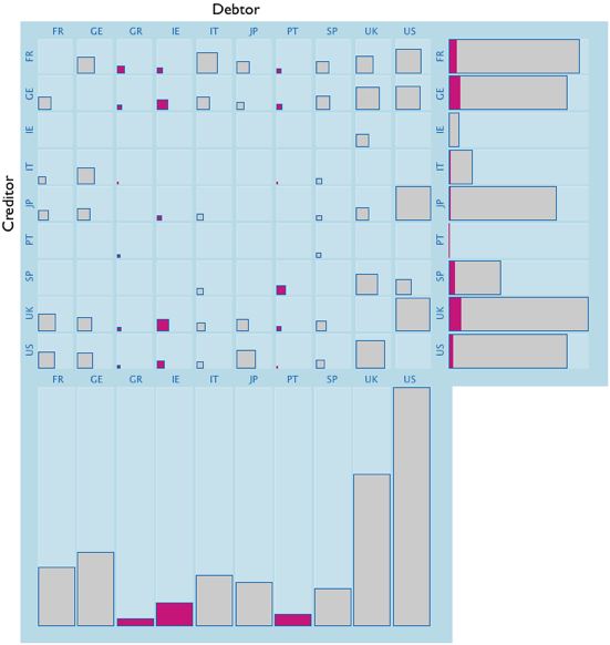
After spinning around in the debt web, I keyed in all the data, and can now create the debt matrix:
I am not sure how much more I can seen now, but I see it now all at once at least. Surprisingly (or maybe not surprisingly) the two countries which would trouble me most, are not within the Euro-Zone and don’t seem to be part of any concerns: UK and US.
One last graph which looks at the influence of the highlighted countries, which already called for help and thus have quite some potential of defaulting on their debts:

The barchart shows creditors sorted according to the share of troubled debt – though I don’t feel enlightened enough to draw any immediate conclusion form this result … I guess the data does only show a small part of what’s going on and no matter how we visualize it, we are not really getting more insight into the crisis.
Maybe it takes another post with more / better data …


[…] http://ftalphaville.ft.com/blog/2010/05/11/226991/dude-wheres-my-web-of-debt/ http://www.theusrus.de/blog/eu-debt-crisis-what-crisis/ http://www.perceptualedge.com/blog/?p=1106 Like this:LikeBe the first to like […]