Graphics *and* Statistics: The Facebook Map
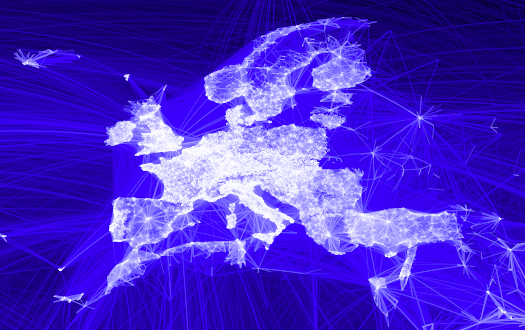
There is this beautiful graph created by the facebook intern Paul Butler showing all (?) connections between facebook accounts:
Paul’s article is called “Visualizing Friendships“, which I would more call “Visualizing connections between facebook accounts”, but that is probably a different matter.
Although this is a beautiful piece of artwork, from a statistical point of view it is not really giving us a great deal of insights. Sure, there are certain “white spots” on the map, where either there is a competitor of facebook more successful or people don’t want to, or can not use this kind of “social” contacts. Obvious examples are Russia or China. But this is info more on a meta level, i.e., not really part of the info shown.
What would be more interesting are things like a comparison between the expected link intensity based on either population, broadband connections or actual facebook accounts and the data Paul compiled. Looking at Germany, e.g., we see the former eastern part being less connected, which is based on both, smaller population density as well as a poorer development of broadband connections.
A visualization of these connection intensities should be hierarchic, starting with continents with the ability to drill down into countries, states and cities. That would certainly mean some development and could not be done in R (yes, this map was created in R!) so easily – maybe a case for iplots.
