Fundamentals: Learning to Cook
For those who are used to work with graphics on a regular basis, it is usually not a question, what plot (or combination of plots) to use when looking at particular data problems. Nevertheless, many statistically trained researcher and practitioners have a hard time to translate data problems into reasonable graphics (not to mention their correct interpretation). To help selecting the “right” graphics to start with, the following table might be of some help:
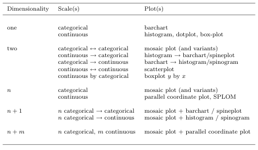
This is certainly only a default orientation – the “killer graphics” will usually take more effort to create. Maybe this “cookbook for graphics starters” should be read along the discussion of Andrew Gelman’s post.
Those who use graphics effectively often are inclined to think they are doing something “low-status”, and think that the guys who come along with the next nifty model for datasets which have never been observed so far are doing “serious work”. That thinking definitely is wrong, and good and useful graphics are not at all easy for most statisticians!
PS: Combinations of graphics are of course most useful if linked highlighting can be used!
