Fundamentals: What’s the story?
In an age where “data is the new oil” (a controversial claim, worth its own post …) there is data everywhere, i.e., data is collected more and more automatically, be it by smartphones, cameras, or social networks sucking up people’s privacy. Having all this data at hand, opens up the possibility to visualize things we never had a chance to look at before. One (early) example is certainly the “Facebook map“.
Going back to a quote of John W. Tukey – who can be seen as the reviving power of statistical graphics, and thus ultimately of visualization in general – we can learn a bit about the motivation behind graphical data analysis
“… paradigm of exploratory data analysis
a) here is the data
b) what is it trying to tell us; in particular, which question does it want us to ask?
c) what seems to be going on?”
Although there seem to be the “data first” aspect in both the classical EDA approach and the modern data visualization, we can find a fine distinction regarding the motivation.
Here are two examples which are dominated by their flashy presentation, but fail to ask the relevant questions and can’t really tell us a story showing what seems to be going on, apart from what we (trivially) knew before.
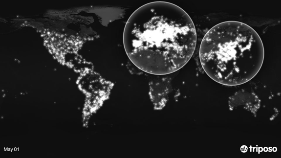
This example is taken from the triposo website and shows locations of photos taken with smartphones and logged with the triposo trip advisory application. Whereas this is a cool visualization; what is it trying to tell us? From the comment on the website, we can see how badly the “story” behind the data fails: “This is probably the clearest example of all: Labor Day celebrations light up Europe and China in a big way. Who doesn’t want to take a picture of a nice 1st of May Parade? …” At least in the last 25 years, it was was hard to find a single 1st of May Parade in Europe.
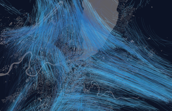
It gets even worse when the visualization actually shows things that are not in the data as in the next example from villevivante.
Nathan did post this example and finished with “It’s hard to say exactly what you’re seeing here because it does move so fast, and it probably means more if you live in or near Geneva, but speaking to the video itself, you have your highs and lows during the start and end of days.” It is not a particular insight that most of us travel into cities to go to work in the morning and move back out to our home at the end of the day. What is interesting though, is that according to the visualization, people in Geneva do not move along roads, but seem to enter the city like a swarm of bees …
To summarize, a good visualization should (at least) fulfill these requirements:
- Be clear about what data was used (especially regarding generalization)
- Make sure the visual abstraction does not lead to misinterpretations
- Actually tell a story
- Answer questions where we didn’t know the answer already


