Minard’s birthday challenge
We got this from Friedrich who is just finishing a sabbatical in Paris:

Michael came up with the idea of a challenge. Here’s what he wrote:
Here’s a graph you may find interesting, published yesterday
in Le Monde.
The manifest goal is to compare estimates of les manifestants at les manifestations according to the unions vs. the police throughout France. An admirable goal for a newspaper, and done with some sensitivity to graphic principles, in a style reminiscent of les Albums: color-coding key (but no scale), time-series sub-graph, numbers included for those who want/need them.
But what do we see, and is there anything we could see better by some other display or encoding of these numbers? Obviously, either the police in Paris can’t count or deliberately misrepresent things, or the unions there have enormously dilated pupils. Is the over-count ratio greater in Paris than in Marseilles? Were the police in Mont de Marsan all en cong’e? Is Dijon the place with the closest correspondence between the estimates? Presumably, they used count ~ area (or sqrt radius); should they have used a different power for better perceptual comparison? What is missing from this display? e.g, how did the turnout in Toulouse compare to that in Nante or Rennes, taking population into account?
best,
-Michael
You can download the data here. Any comments are welcome and of course, any attempt of a better visualization will be posted here!
Have fun!
Here are two posts:
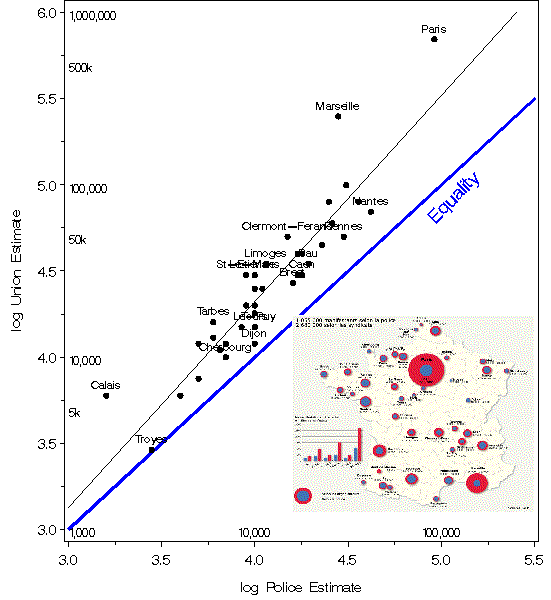
Michael sent this graphics:

He wrote:
“Here is a simple log-log scatterplot that answers some of the questions posed
originally. On a log scale, the relation is fairly linear, with a slope of 1.19, indicating that union estimates are
on average about 154% of those by the police. I’ve labelled only those cities that have a log-residual greater than
0.15, and scaled the axes so that the line of equality is approx. 45 deg.”


