Mondrian Version 1.2 released
The new version (1.2) of Mondrian adds the following (significant) features:
- Scatterplotsmoother now includes “principle curves“, which are one of the nonlinear generalizations of principal components.
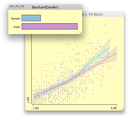
- All smoothers can be plotted for subgroups, which have a color assigned, “smoother by colors“.
- The color scheme has been refined once again, to make use of colors as efficiently as possible.
- alpha-transparency is now consistent between scatterplots and parallel coordinate plots.
- A new transformation: columnwise minimum and maximum.
- Sorting of levels is now stable, i.e. levels which have the same value for an ordering criterion will keep their previous order.
- The Reference Card speaks Windows now, i.e., Windows users no longer need to translate keyboard shortcuts from the Mac world.
Being able to use colors to estimate scatterplot smoothers for different subgroups is really handy – and actually “stolen” from early versions of DataDesk.

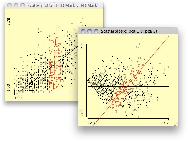
Principal curves are quite fun to play with, as there is no actual functional relationship needed, but the curve is generated such that the sum of the squared orthogonal distances to the curve is minimized. With no flexibility allowed this is obviously the PCA solution, with more and more flexibility the solution(s) get less obvious …

Above example shows the principal curve (actually the PCA-regression, left plot) and a linear least square fit on the first two principal components (right plot), which is actually the same line as in the left plot, only rotated to be a horizontal line. The highlighting in the left plot underlines, that principal curves are not following a functional relationship like y = f(x).
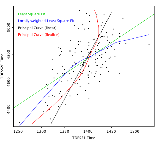
How different the various fits in a scatterplot can look like, can be seen here:
 The plot shows the results of the 1st and the last time trial of the Tour de France in 2005. Depending on the type of rider we might expect the one or the other correlation between the two dimensions, and it is not too obvious, how the times should depend on each other.


This post belongs in Script and Style! Wow! I almost forgot to look at the content of the graphs, as the HTML5/ CSS3 (canvas?) was done so well. Was that the new version of Mondrian, or you? I’m referring to the first to scatter plot charts, followed by the paired principal curve and least-squares regression charts.
Too bad that after the pyrotechnic splendor, the final plot was not exactly conclusive. Form will never replace substance. But this is a very visually appealing post. And that is important too.