When it comes to graphing data in a chart, the scale of the data is the most important factor to determine which graphical representation might be useful. Please pardon me for the examples using the “Iris Data” and the “Titanic Data”; but these data sets are prototypes for multivariate continuous data and multivariate categorical data everybody can relate to.
The first pair of plots (upper row) should puzzle everybody and only extremists of the one or the other graphing method would actually plot the data this way.

The second pair of plots (lower row) uses a SPLOM to graph the iris data and a mosaic plot to visualize the Titanic data, i.e., both datasets a plotted in a graph which respects the scale of the data.
Admittedly, this example seems to be too obvious, but when it comes to more complex datasets with a mixture of continuous and categorical variables it might be quite helpful to know how to choose the right (set of) graphics in order to visualize (and analyze) the data most properly.
(To create the graphics yourself you might use Mondrian)
Robert has a very long and profound post on this chart:
The whole interactive thing can be found here on the GE site. It seems to be a bit of a provocation that Ben Fry’s company uses a tattered pie chart to visualize the data, which is definitely better visualized in a line-chart (i.e., a time series with age as the time axis). There is the suspicion that the radius is proportional to the quantities, which would really take it to the top … Unfortunately we don’t have the data at hand to give an improved version – anyone wants to take the burden to note all the values by hand?
Apart from all technical criticism – which includes the cute animation which is completely useless – there is the fundamental chicken and egg question:
A good visualization should tell us a story about the data you didn’t know before and not the other way round, i.e., once you know the story, you create a visualization around it.
I actually have a hard time to find a story here at all …
Posted
on 10/31/2009, 21:50,
by martin,
under
Books.
 As statisticians we are used to the fact that we have a hard time analyzing data where we lack the knowledge of the background. Election data are a common target in statistical investigations and some of us can not be stopped talking about red and blue states over and over again.
Having won this book at this year’s ASA statistical graphics and computing mixer at the JSM, I was quite surprised that there is so much more to election data than understanding the election process.
Most of my enlightenment was more on the negative side and I felt lucky that German elections still lack a lot of the negative campaigning which is common in the US for decades now.
In any case I found the book as interesting as entertaining – worth reading it!
The last post on the Palm Pre internationalization was a kind of a funny embaressment we all could have a good laugh on. Well, Palm did start to fix it and the current version looks like this:

It is hard to translate a typo into a foreign language (especially as a non-native) but the “2.5 Stundun frei” should actually be “2.5 Stunden frei”, which is like writing “2.5 huurs free” instead of “2.5 hours free”.
Let’s see how the story evolves and whether or not things converge until market start in Germany on October 13th.


There is no doubt, the PalmPre is the only competitor for the iPhone that can be taken seriously, i.e., which has a user interface which is really optimized for small screen devices.
Palm was doing a great job – not only in hiring developers from Jobs – but also in getting the phone to a broad market as soon as possible.
Unfortunately they didn’t pay too much attention regarding the correct translations for the internationalized versions.
The “free time” on the US-version translates into “free of charge time” (kostenlose Zeit) in the DE-version.
I would bet that Apple would have had an eye on this detail, and Steve will have a good time hearing about these minor glitches …
Posted
on 08/15/2009, 11:01,
by martin,
under
General.
Being relatively close to the Kröller-Müller Museum during vacation, it was a good chance to finally see the original painting which is used for the Mondrian logo.

The image used for the logo is actually the “Compositie in kleur B” from 1917 (left painting). The fact that the logo is a 90 degree rotation of the painting seems odd, but that was the choice taken 12 years ago …
Whereas the collection of 11 Mondrians is already very impressive, the van Gogh collection is just breathtaking.
It’s time again to trace the evolving Tour de France. This year is different as Lance Armstrong joined the field again and I am staying in France right now, attending the useR!2009 conference – this may probably limit my updates until Sunday …
| Stage Results |
cumulative Time |
Ranks |
 |
 |
 |
| (click on the images to enlarge) |
That’s it for this year. Alberto CONTADOR is the winner in 2009 and Lance ARMSTRONG finds himself on a remarkable 3rd place after three weeks. Andreas KLÖDEN ranks 6th.
(Note that we are still missing the individual results from stage 4 on the webpages!)
Of course a big thanks goes to Sergej again for keeping the scripts alive!
Robert has released the wonderful parallel sets tool in version 2. It is JAVA, it is interactive – so what do we want more! As I spent some time thinking about the display of categorical data and creating tools for their visualization myself, I thought it would be a great idea to compare the parallel sets approach with mosaic plots and variants like fluctuation diagrams and multiple barcharts. I used the parallel sets tool and Mondrian to create the plots.
Now, when it comes to categorical data, there is no way to get around the
Titanic data
The most interesting feature to find in the Titanic data is the “woman and children first” policy. One oddity is the very small group of surviving male in 2nd class. This feature is queried in both plots.


In both plots we see that there is something wrong with the size of the group of surviving 2nd class males. The policy “woman and children first” though, I find hard to see in the parallel sets – this might be a problem of a better ordering of the axes in the parallel sets view.
Detergent Data
One strength of mosaic plots is to show the degree of an association. The detergent data is a very good example to illustrate this. Let’s see how the two visualizations compare:


Whereas the stronger association between “Preference” and “M-User” is fairly obvious towards harder water and higher temperatures in the mosaic plot, I just see a (nice) regular pattern in the parallel sets.
Census Data
We finally want to look at a type of data where I know that mosaic plots usually have a hard time to deliver decent results and it is usually better to use multiple barcharts or fluctuation diagrams instead


I left out the standard mosaic plot altogether as it fails completely to give any information that can be interpreted. Censored zooming is incredible useful here.
I don’t want to summarize by now as I still need to learn more about parallel sets (which, btw are the same what Matt called hammock plots before).
Looking forward to your comments – which will hopefully lead to take II.
Posted
on 05/18/2009, 21:03,
by martin,
under
General.
The definition of when someone shall be counted as being poor is usually done by some kind of statistics. The definition in Germany is when you earn less than the half of the median income. When you want to look figures to be more dramatic you also add the range where people are counted to be at risk of getting poor, which is when you earn less than 2/3 of the median income.
The trick of the game is now to decide what median income one wants to use. The easiest is to ignore local income differences; here is what you get:
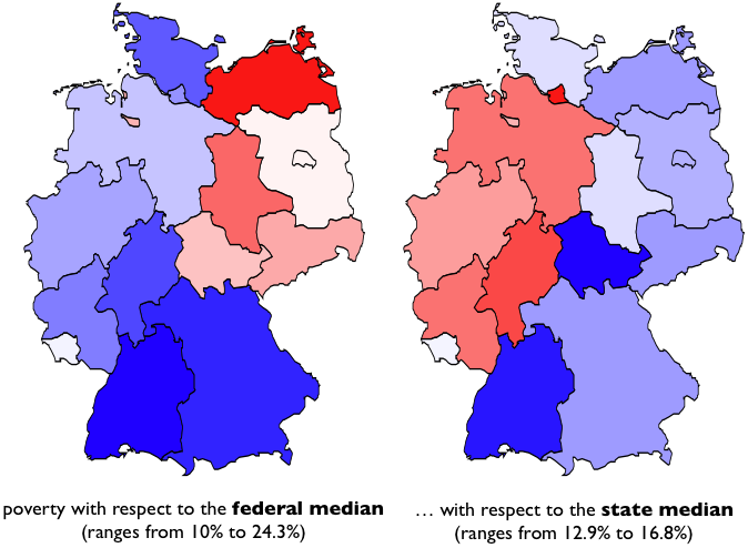
The left hand map assumes an income structure and buying power that does not differ regionally, and ends up with almost a quarter of the population in the north east to live in poverty. Obviously this assumption is quite far off reality (believe me, living in Munich, I know of differences in incomes and buying power) and thus we should look at the right hand plot, which compares to the median income within the particular state. Surprisingly, the formerly poor east turned around, and now most of the western states show higher percentages of poverty. Looking at the range of the data we find that the local version shrinks down the varability of the data to only 2.3% (if we leave out the outlier of Hamburg with 16.8%), showing that all Germans are more or less equally poor – only depending on the general definition; that obviously proved to be poor!
I like to end with a (translated) quote of a German newspaper, which commented “… of course, it would be desirable for everybody to have at least the median income at their disposal, but that would not call for a new political order but for a new kind of mathematics.”
(all data are from the german statistical office)
This post on Junk Charts caught my attention. It is the mosaic plot version of the greenhouse gas chart which was initially a pie chart.

This is maybe one of the best counter examples for mosaic plots.
It is not hard to explain why a “traditional” mosaic plot completely fails to visualize this kind of data:
- there are eight levels for the second category
- many of the cells are (almost) not filled
- there are only two variables in the plot
- (there are no gaps between the variables)
In short, traditional mosaic plots work best when we want to visualize associations between a few categorical variables with few empty cells – to just display a “simple” table, variants of mosaic plots are definitely the better choice.
Let’s come back to the actual data in the example. Here is a screen shot of a Mondrian session showing two barcharts and a multiple barchart of the data:
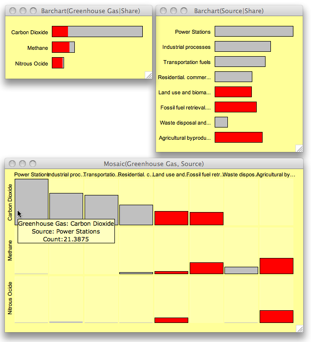
Whereas the sources are relatively uniformly distributed, the gases are clearly dominated by CO_2. Crossing the two variables reveals that half of the cells are empty, which is the reason why a mosaic plot has a hard time to show the data.
‘Source’ is sorted according to the absolute share of CO_2, such that the multiple barchart is easier to read. Looking at the three largest CO_2 sources we find that these categories make up exactly 50% of all greenhouse gas emissions in the data.
Only three sources (as highlighted) generate at least two kinds of gases in reasonable quantities.
It is always a good idea to discuss visualization ideas with real data which we actually want to analyze and understand – as with the greenhouse data here – and not just play around with artificial data as we find here and here. This seems also to be the source of the Marimekko …
Posted
on 05/07/2009, 20:26,
by martin,
under
General.
Some months ago I stumbled over the website of the ifo-institute, which is one of Germany’s most renowned instances when it comes to judgement about the economical situation of the country.
They feature the so called “ifo Index”, which gives an indication of how well the economy is doing based on a survey of a cross-section of various companies (and actually have the data available for download).
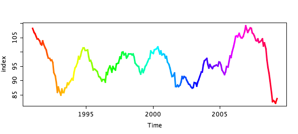
(the color coding is needed to link to the next plot)
I was very surprised to see such a periodic and regular pattern of the economic cycle. Ok, probably not that regular than other time series like the e.g.
CO2 time series, but regular enough to detect an upcoming downswing without being an economic guru. Things get even more obvious when you know that the index is combined out of the assessment of the current economic situation and the expectation for the near future. Plotting these two quantities in a scatterplot shows a (probably not so) surprising spiral pattern.

I marked three points in time in the plot. Whereas many politicians and economists seemed to be surprised by the upcoming (financial) crisis, it is pretty easy to see that the downswing did start in May ’08 and gained full momentum even before the banks crashed in September ’08.
The positive take home message from these plots is definitively that – according to the index – we hit the bottom of the recession.
Posted
on 04/29/2009, 19:51,
by martin,
under
R,
Tools.
As we are used from UNIX. there is not one single suitable solution to solve a problem, but usually a few different ways to do “the same”. Depending on what commands we know (best), we will chose the one or the other solution. Only the absolute expert will be able to choose the most efficient commands.
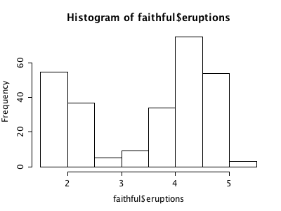
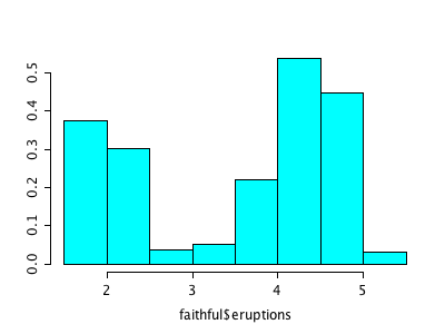
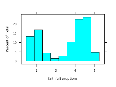
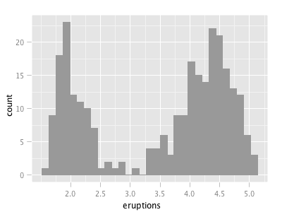
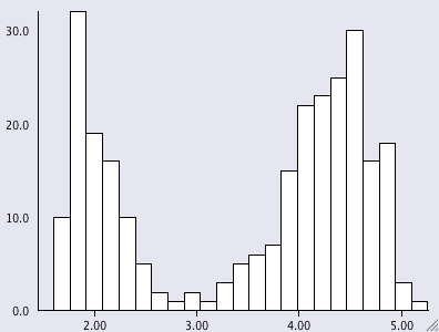
There is a similar situation with R’s graphics (and probably for methods from other domains as well). Let’s look at a simple example like the histogram (I use the Old Faithful Geyser Data here as example).
I don’t claim that this list is complete, but I think it nicely shows “the problem”. Of course, a “real R programmer” can make any of the plots look like one of the others … The question is more, which of the implementations beyond hist from the base library graphics really adds value to what we already had? The second question probably is, how R will ever resolve the backwards compatibility spiral that might make it look like a real legacy project some time – not to mention the package quality issue?