Posted
on 04/17/2009, 21:08,
by martin,
under
References.
As I know from past experience, statisticians usually don’t read what computer scientists do and vice versa. Thus I have good reason to assume that the two posts came up independently:
Both are looking for good “out of the box” visualization tools, or a tool for exploratory data plots – I don’t see a difference here as long as you aim at data analysis with graphical tools.
Any further tools or thoughts?
Posted
on 03/26/2009, 20:42,
by martin,
under
General.
I recently stumbled over the “Synoptic” project. It is a nice animated visualization of weather data – not particularly unique, but aesthetically well done.
I don’t have to argue about the lack of any generality regarding data analysis tasks here …
What caught my attention is the overall “staging” of the presentation. When you compare the “Synoptic” page with the (somewhat famous)
demo movie of
prefuse, you will pretty soon understand what I mean.
As a statistician – who grew up in an academic environment built up by math people – I can at least learn the marketing lessons here …
(Make sure to have your sound turned on, otherwise you will miss the point)
Posted
on 03/16/2009, 20:30,
by martin,
under
General.
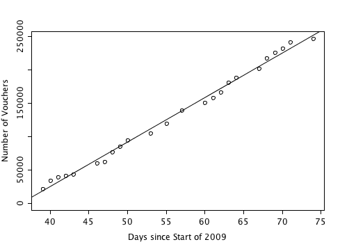
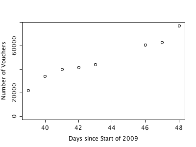
Here is the data for the so called “Umweltprämie”
21995 9.2.2009
34210 10.2.2009
39856 11.2.2009
41619 12.2.2009
44161 13.2.2009
60730 16.2.2009
62806 17.2.2009
76926 18.2.2009
85304 19.2.2009
94691 20.2.2009
104840 23.2.2009
120016 25.2.2009
139964 27.2.2009
150722 2.3.2009
157696 3.3.2009
166238 4.3.2009
180492 5.3.2009
188421 6.3.2009
201469 9.3.2009
217693 10.3.2009
225870 11.3.2009
231533 12.3.2009
241280 13.3.2009
246853 16.3.2009
Using the trivial linear least square fit will now yield the 7th of May.
There is still no real hint to anything different than a more or less linear increase, but the last point may be the first indicator for a saturation – how may cars are out there, willing to be trashed …?
Posted
on 02/19/2009, 22:35,
by martin,
under
General.
Here is what Andrew Gelman posted on his blog:
I have never ever seen an example where I’ve felt a boxplot was appropriate. I’m open to being convinced, but I don’t think you’ll be able to convince me. Bring on the examples!
You can imagine that I can’t really agree with him, and I guess that the Tour de France examples posted on this blog are at least one counterexample showing the flexibility and usefulness of boxplots. There are certainly some drawbacks of the design (symmetric whiskers, very large data, …) but over all, boxplots are as simple as versatile – who would dare to ignore this.
Feel free to comment, I promis, I won’t censor your comments …
Posted
on 02/16/2009, 21:46,
by martin,
under
General.
Like all nations who fight the global financial and economic crises, Germany has put a package over several hundred billion euros. One part of the package is the so called “Umweltprämie”, which is nothing else than a voucher over 2,500 euros for everybody who turns in his/her 9 or more years old car to be trashed and buys a new car.
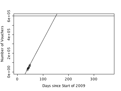
Although we can assume the number of nine or more year old cars to be finite, there is a limit on the number of vouchers, which is set to 600,000. Now we come to the
trivial plot. The simple pie chart shows the proportion of voucher given out so far.
I did start to record the numbers last week, and with a week worth of data the increase looks like this:
So far we seem to be still far away from the limit of 600,00. A simple linear regression yields this graph, and a results that tells us that the vouchers will be used up even before summer at May 31st:
The linear estimate is certainly not a very fancy prediction here …
When we have something around three weeks of data, I will post the data and open up the round for the best prediction – stay tuned!
Posted
on 02/02/2009, 19:51,
by martin,
under
General.
At www.politifact.com they put up the Obameter – the ultimate chart, which shows the progress of president Obama’s work.
So far just a simple barchart, but it has the potential for a timeseries chart, which shows Obama’s success – or failure – over time.
Posted
on 01/20/2009, 21:36,
by martin,
under
General.
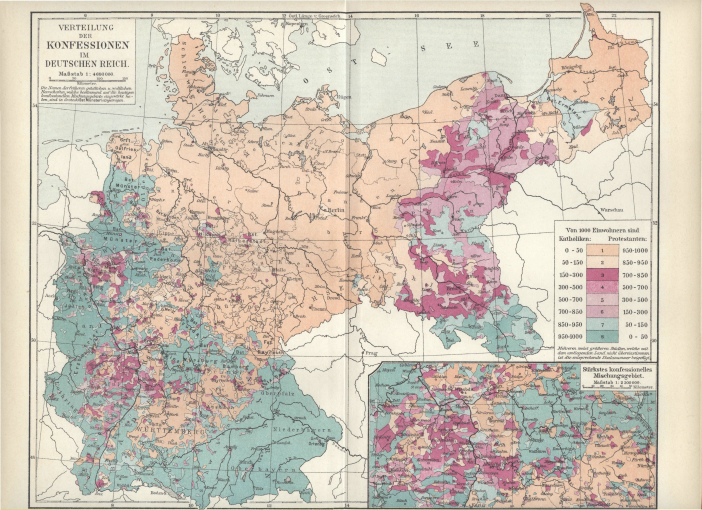
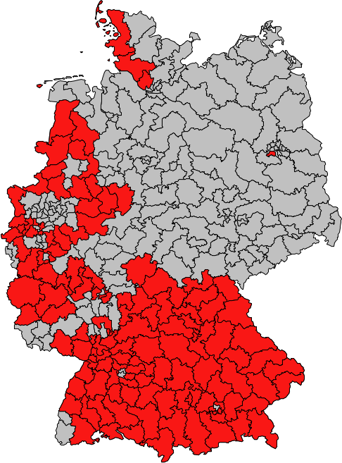
Well, certainly not – or better not completely. It was the post at strangemaps which inspired me to check for something which I somehow always suspected, but never went after.
With the end of the 30 years war in 1648 and the reinstitution of the Augsburg religious peace of 1555 the german map was set between protestants and catholics – depending on what the dukes, counts and earls defined.
So here is the
Wikipedia map, showing the distribution of protestants and catholics in Germany in 1893 – green indicates a majority of catholics, beige a majority of protestants:
and here is the map of the last Germany election, with all election districts highlighted where the conservative party (CDU/CSU) has a margin of at least 1% over the socialistic party (SPD, lets forget about things like pseudo environmentalists or left-wing extremists for now)
Overlaying the two maps gives a quite convincing result; although we could have fine-tuned the election maps a bit to get a more precise overlap …
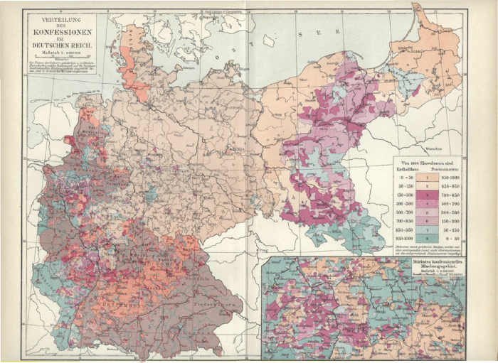
(don’t be fooled by the missmatch at the uncovered area in the south west; those guys elect the french president and not the german chancellor.)
Everything started with the article in the NYT talking about R – and of course – did mention SAS. Andrew Gelman picked up the article and posted his take on the matter. Maybe it are sentences like Andrew’s “And it’s good to hear that SAS is in trouble” and Anne H. Milley, director of technology product marketing at SAS: “We have customers who build engines for aircraft. I am happy they are not using freeware when I get on a jet.”, which did stir the readers up.
No doubt, once the scene is set, the ring is open and Andrew’s post got 35 often very engaged comments (as of now). I do not want to open another round of pros and cons of R and SAS – I think almost everything is said; whereas I am unsure about whether or not anyone did mention the horrible graphics of SAS yet – but wonder why there is such a polarization between the two camps?
The only thing I can think of would be a situation where people are forced to work with a tool they would not choose on their own; or more specific: students did learn using R for statistical computing at the university and then join a company which uses SAS. Anyway, it is hard to think of R loosing ground again in the future and SAS will definitely loose more and more users to R which are unlikely to ever use SAS even if R would vanish.
PS: When we talk about SAS, we should not forget to mention John Sall’s JMP and the new kid on the block “SAS Stat Studio” – both not SAS mainstream, but really useful for analyzing data.
Don’t miss this great 25min documentary on the London tube map. You find it at information aesthetics.
There is one central sentence by Milton Glaser I like most:
“…. All design basically is a strange combination of the intelligence and the intuition, where the intelligence only takes you so far and than your intuition has to reconcile some of the logic in some peculiar way. …”
This somehow gives us the limits how much we potentially can formalize or teach about (graph)-design.
Hard to believe that this map design is actually the prototype of all the subway maps around the world we are used to read in a unified manner today.
Posted
on 07/18/2008, 21:36,
by martin,
under
General.
Attending a recent workshop on data visualization, the discussion after a presentation on a graphical display technique to visualize a particular type of data (sorry for not being more precise here, but the presenter would not like to be identified too easily) led to the quote of the speaker:
“I don’t care about the data, I am just interested in the method …”
which sparked a hefty discussion whether or not this can possibly be an answer a statistician is allowed to give – I would say “no”; what do you think ..?
Matt pointed me to this nice report on Bill Gates trying to download one of “his” products.
Here is the e-mail, he sent to some of his staff.
Make sure not to miss the performance from Dave Ross of KIRO-AM/710 when reading this e-mail – very nice.
I wish this Bill Gates would have been more effective during his active career!
Posted
on 07/17/2008, 21:04,
by martin,
under
General.
Again, in 2008 the most interesting thing for a statistician following the Tour de France is to look for means to detect possible doping cases. Right now we have the total results for the first 11 stages for all teams, and a simple boxplot of total time after stage 11 against team – ranked by the median time – looks like this:

Not that this is a final evidence, but the gap between the 5th and the 6th ranked team makes me a bit suspicious … Let’s see how things will further develop.
If anyone wants to come up with a sophisticated model, I am happy to share the data, we have collected so far.


