


Le Tour: the Good & the Bad
It would be interesting to see, whether or not we could use graphics (or other statistical methods) to identify potential doping candidates …
The only thing we would need is a list of drivers who either
- admitted doping
- are convicted
- or are accused to be involved in doping.
At least we could use the list to look at the 2005 and 2006 results to find patterns …
Sergej did collect some data from:
- http://en.wikipedia.org/wiki/Operaci%C3%B3n_Puerto_doping_case
- http://en.wikipedia.org/wiki/Doping_at_the_Tour_de_France
- http://sports.yahoo.com/sc/news?slug=ap-tourdefrance-dropouts&prov=ap&type=lgns
- http://en.wikipedia.org/wiki/List_of_sportspeople_who_tested_positive_for_banned_substances
Here is what it looks like when we highlight these drivers in the 2004 classement:
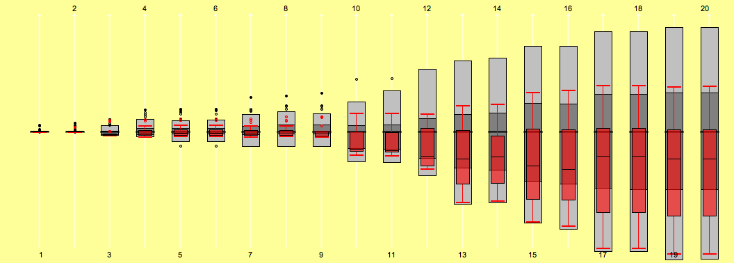
There is more to look at, but for a first view pretty consistent …
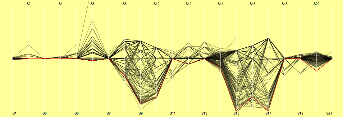
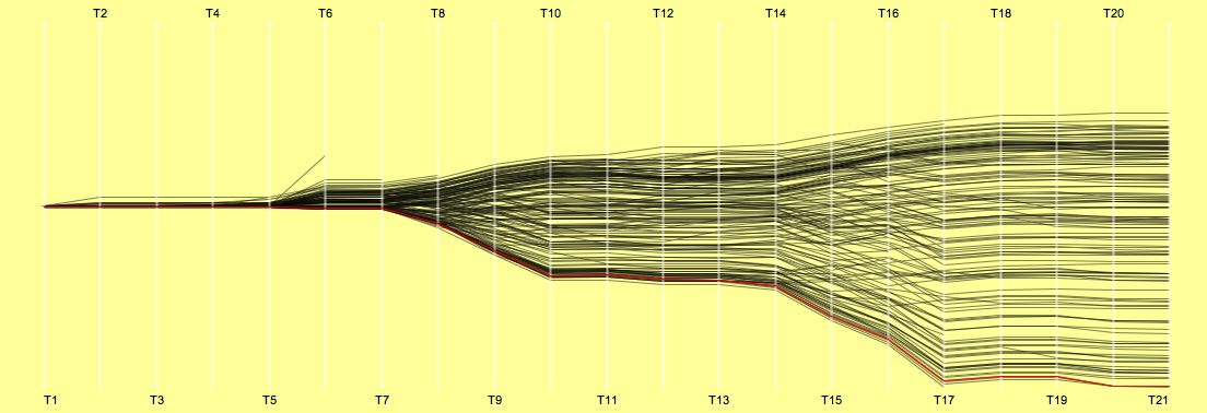
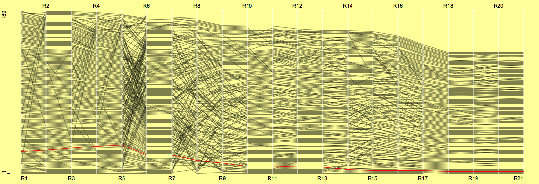
Le Tour 2007
That’s it for the 2007 chaos tour. Looking at the time distributions makes everybody above the median quite suspicious … more doping cases to come – maybe including A.C.
Although many people claim little interest in the tour after the many doping cases, this is all the more a reason to check whether we will find a structural change of the 2007 race compared to the races of the years 2006 and 2005.
| Stage Results | cumulative Time | Ranks |
|---|---|---|
 |
 |
 |
| (click on the images to enlarge) | ||
Prologue: Andreas KLÖDEN – one of the “last big ones” left – No.2
Stage 01: calm ride through the English country side …
Stage 02: one big crash and one time for all
Stage 03: CANCELLARA defends the jersey impressively
Stage 04: HUSHOVD’S day!
Stage 05: VINOKOUROV falls back after his crash
Stage 06: Another day to rest – not only for VINOKOUROV and KLÖDEN
Stage 07: GERDEMANN aiming at white, rewarded with yellow – more than a 1-shot?
Stage 08: Nobody could stop RASMUSSEN!
Stage 09: Last stage in the Alpes and 18 drop-outs so far
Stage 10: German television stops live broadcasting after SINKEWITZ’s case came up
Stage 11: VANSEVENANT ‘defends’ his last place successfully …
Stage 12: A day to rest on the bike.
Stage 13: VINOKOUROV “found his legs again”, at least for a day.
Stage 14: RASMUSSEN still in yellow – despite the doping case …
Stage 15: Another stage for VINOKOUROV
Stage 16: VINOKOUROV’s case end the tour for team Astana
Stage 17: “A team a day keeps doping away …”
…
(Thanks to Sergej for updating the scripts)
More on the teapot …
Just bought Donald A. Norman’s Book “Emotional Design” (I know, out for some time now, but …).

Although I didn’t get much further than the Prologue, it widens the set of design paradigms to a more realistic scope. One can argue about how valid it is to build on specific emotional reactions when designing products, but there are certain facts we can’t ignore.
I won’t forget when I unpacked my G5. This is like owning a Porsche – the only difference is, it is far less expensive to upgrade from the discounter’s PC to the G5 than from a Kia to a Porsche. Operating and navigating a 2nd gen. iPod nano has similar emotions to it: it justs fits right; nothing fancy about it, just right.
I think this is closely related to what Norman writes on page 10
“The surprise is that we now have evidence that aesthetically pleasing objects enable you to work better.”
… Redmond can you hear me?!
Presentation vs. Exploration
Giving a clear separation between presentation graphics and graphics for data exploration is not always easy, because many aspects of the graphics are shared by both types. I very much liked the distinction Antony Unwin gave during one of his latest talks.
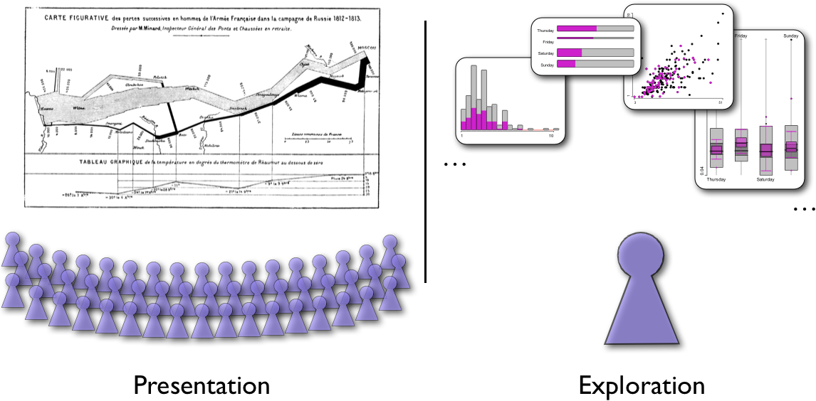
The difference is quite obvious when you look at the ratio of graphics and observers. In presentation graphics we need to build very few – or even just one – graphics for very many (potentially quite different) observer. In exploration graphics often a single researcher looks at a lot of graphics, which only make sense as a linked ensemble.
Any further thoughts …?
Yet another pie chart …
Pie charts are as popular as entertaining. The latest highlight of chartjunk is here:

The pie chart was created by a java code profiling utility which is called checkstyle. I think I can leave it to the reader to find all the points, which go wrong here … the use of transparency is clearly hard to top.
Thanks to Markus for pointing me to this nice pie.
On the Interface …
Although the topic “User Interfaces” appears in the title of the blog, I didn’t post anything related yet.
Moving into a new office building confronted everybody with the new switches in the offices which control light, temperatures …
Here is what they look like:
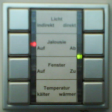

(Sorry for the fuzzy photo, but the 2MP cam in my SE-phone isn’t capable of more …)
The only thing that works as expected here are the light switches, which toggle between ON and OFF – except that you always have to read the text in order to find the desired kind of illumination.
Touching the buttons of the shades makes them go up or down as expected, but the problem arises when you try to stop them. Hitting the button again does not do the job, hitting the button for the other direction reverses the direction but does not stop them either – hmmm?!
The solution: Pressing the buttons for more than 1 second will stop them when you release the button. Unfortunately the delay of 1 second is about the average time people will press the button, resulting in an apparently random behaviour.
The porthole-like windows open and close when pressing the corresponding button – this time they only move as long as you actually press the button.
The highlight is the temperature control. You can press ‘cooler’ or ‘warmer’ and … wait. One very important issue in user interface design is feedback. I actually could not figure out how the temperature control works until I read the manual!
The feedback works as follows:
There will be a red light next to ‘cooler’ when it is the standard temperature of 21C. When you press ‘warner’ once it will be 1 degree warmer indicated by a red light next to ‘Window open’, and once again, i.e., 2 degrees warmer light the LED next to ‘Shades up’ (as in the picture).
The whole thing works for cooler as well, but now the LEDs will flash to indicate that it is cooler than standard … The only purpose of the green LED is to indicate that the AC is actually working, which won’t be the case as soon as you open the window.
Would you have guessed?
The Good & the Bad [11/2006]
This time it is easy for me, as I just need to point to the interesting discussion at Junk Charts.
The original graphics is from the NYT:

The “improved” plot looks like this:

The advantages of the box-plot view (from Junkcharts)
- The European market is much more fragmented than the U.S. market.
- The Big 2 (GM, Ford) has had mixed fortunes over this period (as indicated by the large variance)
- The Big 2 are competitive in Europe although they are definitely not dominant there
- Several key players in Europe (Peugeot, Renault, Fiat, BMW) have negligible shares in the U.S
The discussion was quite lengthy, but had the two major points:
- Boxplots are too hard to read for NYT readers
- The boxplots ignore the temporal information and thus are not really suitable for this data
One important point was not mentioned explicitly, which is
- Sorting is a very powerful and important option in graphics
There is truth to all the issues raised here, and the bottom line is probably that there might be not a single graphical view on the data which covers all aspects of the data. Furthermore, the NYT graphics is by far the most eye-pleasing version of all suggestions.
In this spirit I want to throw in two more versions which show the data:
Two variations of Mosaic Plots (will be explained in the next ‘statistical graphics 101’) in the multiple barchart view. European cars are highlighted:
(Year x Brand x Continent) 
(Continent x Brand x Year) 
Concordance Visualization
Books featuring the “Search Inside” option in Amazon also have a concordance (here is a definition) added to the books info.
Here are the 100 most frequently used words in Graphics of Large Datasets. Obviously, we are talking about how to “plot large data in figures”.
(Pause the mouse over a keyword to see the number of occurences or click the link to see the context where the word is found)
statistical graphics 101: Histograms
It’s been too long since the last posting (on barcharts) in the teaching corner. This one will be on histograms.
Histograms are often mistaken with barcharts. The fundamental distinction between the two is
- Barcharts show counts (or weights) for the discrete axis of a categorical variable
- Histograms show an approximation of the density function (if scaled accordingly) of a countinuous variable.
As a consequence, the only thing that can be quantified in a barchart is the bar height (better length, which makes it independent from their orientation). On the other hand, in a histogram, the area of the boxes is proportional to the density approximation. If all bars have the same width in a barcharts, or gaps are drawn in a histogram (which is complete nonsense), the two plots can get mixed up.
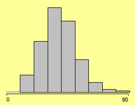
(% votes for Kerry in the 2004 presidential election)
Much has been written about optimal bin width for histograms – almost nothing about the choice of the anchor point. Changing the latter often changes the shape of the histogram more dramatic than choosing between 8, 9 or 10 bins.
Setting the anchor point from 0 to -2.4 yields:

(changing the anchor point to -2.4)
In most applications, there are sensible breaks which can be chosen. Since we look at 3,111 voting districts, we can use far more bins and start at 0 with bin width of 5.
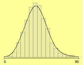
(using meaningful parameters (0, 5) – density estimate added)
If we link a second attribute into the histogram, the whole thing gets more exiting!
(all districts where more than 15% have a college degree selected)
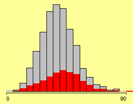
We don’t really can see what is going on here (although we might guess, that there is a slightly higher proportion of highlighting towards the higher votes for Kerry).
When we use the same normalization trick as for Spineplots (see previous post), we get the clearer picture of the Spinogram:
(highlighting in a Spinogram)
Well, that’s what we would have expected, probably except for the increase at the left end of the scale.
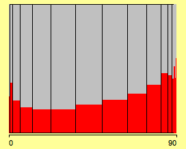
The problem with the histograms used so far is that we looked at voting districts, and not at voters! This will distort the impression if the districts are not of equal size. Weighting above histogram will move the mode further to the right.

(the weighted histogram represents voters not districts)
Finally we get the weighted spinogram, which probably supports more the hypothesis … of the selected group.

(the weighted spinogram)
(Sorry for the lengthy post … but concepts get a bit more complex)
The Good & the Bad [10/2006]
Antony pointed me to this nice example found on BBC News.

So what is the message here? “Chinese and other foreigners (not being British nationals) more and more fill Brirish jails …”
Well, as we look at the percentage changes, we do not have any clue about the underlying group sizes. As whites are by far the larger group in this example, the absolute increase for whites is certainly much bigger. Any better display at hand?
So called “Skyline Plots” – as implemented in RENOIR – take the absolute size of groups into account by adjusting the bin width, such that the plot covers both aspects: absolute and relative change.

(This is certainly a different example as the one from BBC News, but without the absolute figures it is impossible to recreate the skyline plot for the prison example.)
Looking at the colors, we find the odd choice of coding an increase of prisoners in green and the decrease in red. (Does not make much sense, unless the graph comes from the company which runs the prison …)
Communities of Interest …
… is the name for subgraphs of a large network (e.g. telephone calls) which have certain target properties.
Chris Volinsky has a very nice page, which allows to look for subgraphs that connect authors by papers in computer science journals (based on DBLP) or actors connected by movies (based on IMDB).
Here is the proximity graph that connects me (not being a computer scientist) with Donald E. Knuth:

Visit Chris’ page here.

