Prolog: Did anyone have Thor HUSHOVD on his list?
Stage 01: Except for 5, all arrived in the peleton
Stage 02: MC EWEN already on 3.
Stage 03: First drop outs
Stage 04: BOONEN still keeps the yellow jersey
Stage 05: Only O’GRADY can’t keep the pace of the top 10 from the Prolog
Stage 06: First 37 still in a window of one minute
Stage 07: This was the day of team T-Mobile!
Stage 08: No stage to remember …
Stage 09: Still waiting for the mountains, so we look at Sebastian JOLY …
Stage 10: MERCADO and DESSEL out of the blue?
Stage 11: LANDIS now in yellow
Stage 12: POPOVYCH’s day, now on 10. 5 withdrawls after the mountains.
Stage 13: PEREIRO SIO’s second place awards him the yellow jersey.
Stage 14: No changes within the top 17.
Stage 15: LANDIS back in yellow; two more mountain stages; down to 152
Stage 16: LANDIS passes yellow to PEREIRO, KLÖDEN the real winner in the end?
Stage 17: LANDIS back after great ride; top 3 within 30”
Stage 18: No changes, we are all waiting for the show down tomorrow
Stage 19: Everything as expected, LANDIS too strong for PEREIRO
Stage 20: Profile of a winner …
To play with the data yourself, get the Mondrian software and the dataset. Thanks goes to Sergej Potapov, who wrote the script to manage the data!
Posted
on 06/26/2006, 10:50,
by martin,
under General.
Here is an example of the so called “Sectioned Density Plot”, which was recently published in “The American Statistician” (Vol 60, No. 2, 167-174).
Using a simple histogram, maybe with an added density estimator, and/or a simple standard boxplot for group comparison does the job here. No need to “invent” a new plot, which introduces more problems as it solves any.
Actually this plot makes a good case against the use of graphics …
Haven’t we been preaching against 3-d barcharts and the like for a long time? Here is what we didn’t think of in our wildest dreams: an animated 3-d barchart!
As you might guess, this is the usage statistics from this blog over the last week. It is not hard to draw “The Good” (far less sensational)
(This statistics also tells me why my quota is used up, so I moved most of the recent stuff to another server!)
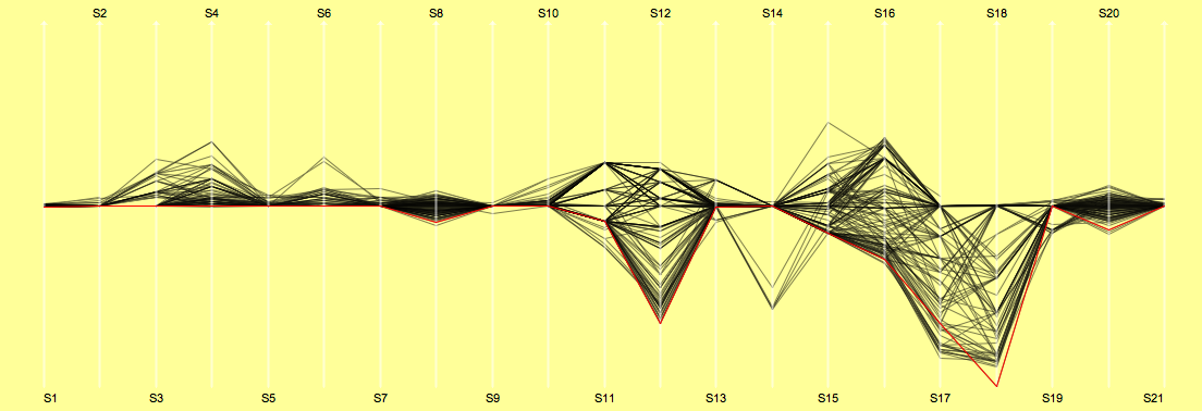
Well, the Tour de France 2006 is only a few weeks ahead, probably still time to give an update on the 2005 data.
We now have the data recompiled with drop outs (thanks to Sergej).
Interesting to see that almost half of the cyclists categorized as “sprinter” don’t make it to the Champs-Elysees.
Looking at the ranks is quite funny as well. Here’s what happens when you start as first and last …
(Certainly, David Zabriskie would have probably looked better when not having the crash in the team time trial)
Posted
on 06/03/2006, 09:29,
by martin,
under References.
For those of you who do not stop by at JunkCharts regularly, here is what John S. found:
Probably one of the best example of “featurism”; computer scientists set free with no idea of application …
Posted
on 03/29/2006, 21:51,
by martin,
under General.
We got this from Friedrich who is just finishing a sabbatical in Paris:
Michael came up with the idea of a challenge. Here’s what he wrote:
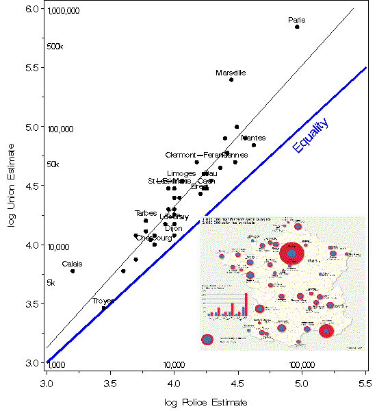
Here’s a graph you may find interesting, published yesterday
in Le Monde.
The manifest goal is to compare estimates of les manifestants at les manifestations according to the unions vs. the police throughout France. An admirable goal for a newspaper, and done with some sensitivity to graphic principles, in a style reminiscent of les Albums: color-coding key (but no scale), time-series sub-graph, numbers included for those who want/need them.
But what do we see, and is there anything we could see better by some other display or encoding of these numbers? Obviously, either the police in Paris can’t count or deliberately misrepresent things, or the unions there have enormously dilated pupils. Is the over-count ratio greater in Paris than in Marseilles? Were the police in Mont de Marsan all en cong’e? Is Dijon the place with the closest correspondence between the estimates? Presumably, they used count ~ area (or sqrt radius); should they have used a different power for better perceptual comparison? What is missing from this display? e.g, how did the turnout in Toulouse compare to that in Nante or Rennes, taking population into account?
best,
-Michael
You can download the data here. Any comments are welcome and of course, any attempt of a better visualization will be posted here!
Have fun!
Here are two posts:
Michael sent this graphics:
He wrote:
“Here is a simple log-log scatterplot that answers some of the questions posed
originally. On a log scale, the relation is fairly linear, with a slope of 1.19, indicating that union estimates are
on average about 154% of those by the police. I’ve labelled only those cities that have a log-residual greater than
0.15, and scaled the axes so that the line of equality is approx. 45 deg.”
Posted
on 03/27/2006, 09:51,
by martin,
under General.
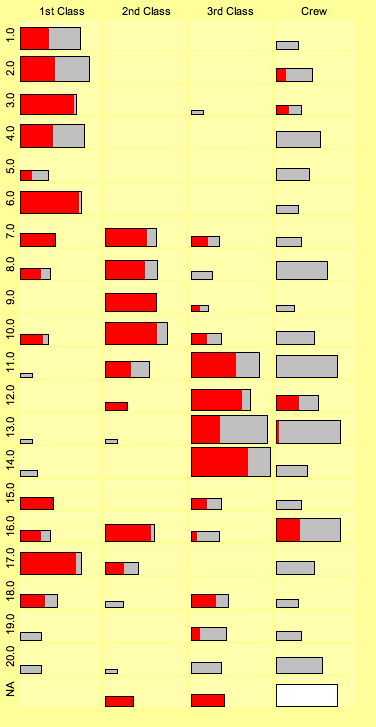
There are many stories and myths about the sinking of the Titanic.
We recently compiled the data on the lifeboats (721 passengers who entered a lifeboat) and a nice pattern came out in the fluctuation diagram of “launch sequence no.” against “class”.
This time no fancy graph, but a nice example of “less can be more”. I took this month’s example from the R Graph Gallery.
Here’s “The Bad”:
Above graphics tries to depict a r by s table in a 3-d view.
Uwe’s example has several problems
The 3-d view make a judgement of the heights almost impossible
The chosen view point (seems to be the default) puts 2 to 3 bars into a row, which makes it even harder to read the plot
What does the gray shading of the bars mean?
Why use meaningless random data for the example … (if there is nothing to interpret in the data, it is hard to prove that the plot has problems in interpreting the data displayed)
“The Good” uses Bertin’s “Accident” data. It is a simple fluctuation diagram of Age vs. Vehicle which performs very well to display simple tables:
Sizes of tiles are simply proportional to the counts in the category. Patterns and trends are easy to depict, though it lacks the fancy 3-d property …
(There will be a “Statgraphics 101” on Mosaic plots and alike soon …)
The nice thing of this gallery is that you can get the sources of all examples, so this can be a good starting point for your own custom graphics in R.
In my own experience, I find it very hard to teach student programmers the Do’s and Don’ts in good user interface design. If the only thing they are used to is Windows or some X11 window manager, you kind of start at 0.
I wonder, whether the ironic way is more effective than teaching the how to’s directly (given they understand the irony!)?
and explained by “Each disk represents one of the 400 richest Americans. They are arranged by hometown, and their size represents the person’s wealth:”
So this is obviously “The Bad”!
The guys who designed this graphics were obviously very ambitious to get as much information in it as possible. Let’s forget about the different years, what do we have here:
Different colors for different states (actually meaningless)
10 different colors for the wealth ranges (arbitrarily ordered)
the circle diameters are somehow proportional to the wealth (coding essentially the same as the 10 colors)
Heights for the number of cases at a certain location (with quirky 3-d effect)
… and of course the geographic location.
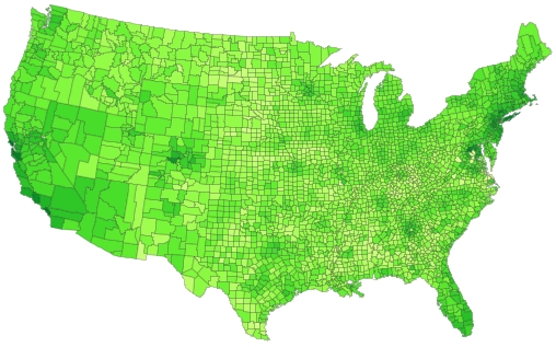
Since I don’t have the underlying data to produce the plot (would be to painful to get it from Forbes website) I can only present a graphics which does better for different data.
This is a choropleth map on US County level (showing rental prices). Adding the (x,y) coordinates of the actual cities where the millionaires live would be a good idea, too.
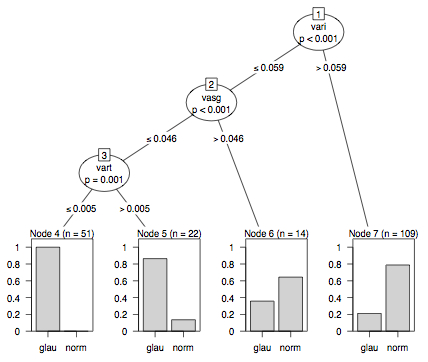
Yes, it has been a while since I posted a “Good & Bad” …
But as I saw this “novel decision tree plot” on an advertisement by C&H for Paul’s R Graphics book, I got inspired again …
Now here is “The Bad”:
Let me explain, what went wrong with the R graphics:
A tree, which is just a special graph, consists of nodes and edges A full featured barchart in a leaf is certainly a doubtfull glyph for a leaf/node!
The size of the nodes must be read as text …
Side by side barcharts are among the weaker representations to display a proportion
The numbering of the nodes is non-standard and does not help reading the information
Now think of a tree with, say, 10 inner nodes and 11 leaves! How big must the plotting device be to display so much (overhead) information?
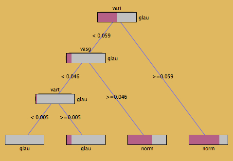
… and here is “The Good” (from Simon Urbanek’s KLIMT)
This representation is much clearer. Not to overstress Tufte, but the data-ink-ratio in the KLIMT plot is hard to beat!
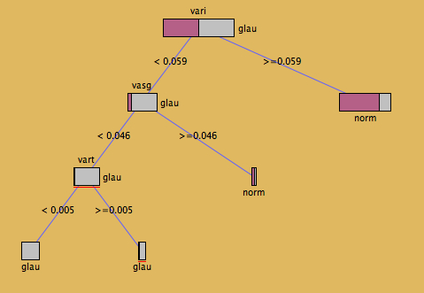
I personally would prefer the next display (which only takes two key-strokes to change from the first plot!), which puts leaves on the “correct” level and has proportionally sized nodes.