Posted
on 07/20/2005, 19:01,
by martin,
under
General.
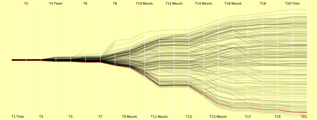
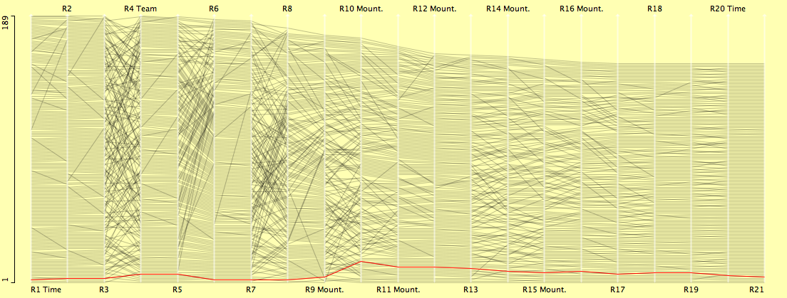
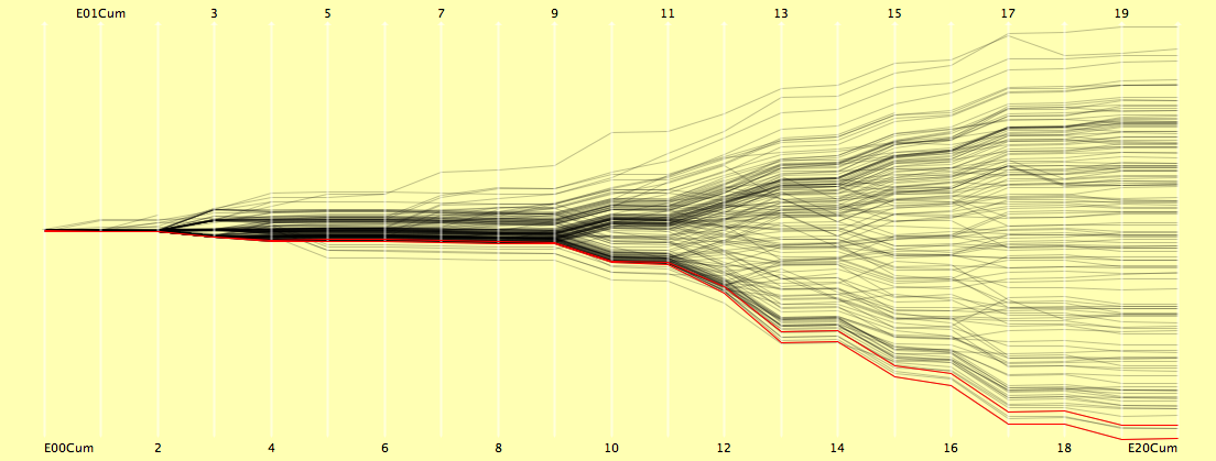
This special will track the development of the Tour de France 2005. Using parallel coordinate plots, the stage result, total elapsed time and the current ranking are displayed from day to day.
All Stages
| Stage Results |
cumulative Time |
Ranks |
 |
 |
 |
| (click on the images to enlarge) |
Stage 02: ZANINI, VAN BON and VANSEVENANT fell behind in stage 2.
Stage 03: HINAULT, ALBASINI and ZABALLA fell behind in stage 3.
Stage 04: ZABRISKIE lost the yellow jersey after crashing close to the finish.
Stage 05: Calm day, no trouble. ZABALLA is the first withdrawel.
Stage 06: VINOKOUROV’s first (small) step towards ARMSTRONG.
Stage 07: Another mass arrival.
Stage 08: The first mountains spread the field – ZABRISKIE now almost last!
Stage 09: VOIGT gets the yellow jersey, ARMSTRONG back to No. 3, ZABRISKIE out.
Stage 10: ARMSTRONG in yellow again, VOIGT back to 72, Ullrich fighting.
Stage 11: VINOKOUROV’s day, VOIGT out.
Stage 12: Calm day after the last Alps stage.
Stage 13: Day of the sprinter. VALVERDE out.
Stage 14: TOTSCHNIG wins, BOTERO lost almost 30′.
Stage 15: RASMUSSEN and BASSO switch places, Ullrich can’t keep pace.
Stage 16: No big changes, BOTERO definitely doesn’t like the Pyrenees.
Stage 17: SAVOLDELLI wins longest stage with biggest gap, KLÖDEN out.
Stage 18: ULLRICH gains 37″ on RASMUSSEN.
Stage 19: Second T-Mobile victory. ULLRICH needs more than 2′ to RASMUSSEN.
Stage 20: All of bad luck for RASMUSSEN, ULLRICH now 3rd.
Stage 21: VINOKOUROV’s good bye to T-Mobile …
Thanks for following this special, and see you next year!
This is the parallel coordinate plot for the total time of the 2004 Tour de France for all stages.
Lance Armtrong and Jan Ullrich are highlighted.
To play with the data yourself, get the Mondrian software and the dataset.
This month’s edition is just perfect to show how NOT to do it!
The Bad of the month May is from a talk by Kurt Hornik given at the compstat 2004 meeting in Prague. It looks like follows:
This is the famous barley data used in Bill Cleveland’s Visualizing Data many times.
Well, on a first view we would say it looks good …
Here is what went wrong with this graphic:
- Never use areas to display continuous variables. Continuous values should be plotted along an axis as points or other sensible glyphs.
- Use stacked barcharts only for proportions, that add up to a fixed amount (say 100%). Put the least varying class at the bottom of the stack, the more varying clases at the top.
- Avoid ”scale hopping”, i.e. the things that should be compared must be plotted along ONE scale.
(Not to mention that the legend messes up the colors …)
Can you see anything ‘out of line’ in the data?
Using the same lattice package in R, we can do much better. Here is the Good:

Now we use points, and only have one scale for the whole plot … and, aha! Somethings wrong with the field in Morris.
But talking about this feature and talking about statistical graphics, there is only one very simple and long known plot to display the feature in the data: the Interaction Plot.

The feature we spotted in the data is nothing else than an interaction of the factor year for the site Morris, which is mostly related to a transcription error.
Going from the first to the third plot, we more and more focus on the ‘right’ information, and need less ink to draw it, which nicely corresponds to Tufte’s data/ink ratio.
Obviously, boxplots are another good choice for visualize this kind of data.
This month’s graphics is the Barchart. The barchart is used to visualize categorical data. It is often confused with the histogram, which can only be used if the data is continuous. The following barchart shows the distribution of all passengers of the Titanic according to their classes.
All passengers who survived are highlighted in red. As it is not an easy task to compare the proportions between the classes, one might want to switch to the
Spineplot view. In a spineplot, the proportionality is exchanged between width and height, but the highlighting direction is kept the same.

In a spineplot it is a trivial task to compare the highlighting across categories.
Two examples of plotting geographical information.
The first ”The Bad” is from ”Informationen zur politischen Bildung, No. 285″ (Information for political education) and gives a very good example how badly human perception works for judging the area of a circle

The second “The Good” is from the 19th century and shows a map of several kinds of cattle in Bavaria in Germany. The author of this graph uses a quite fancy double overlay to mix the two measures in one map. (Can be found in Howard Wainer’s ”Visual Revelations”).

Posted
on 03/07/2005, 20:29,
by martin,
under
Books.

Exploring Geovisualization is a collection of articles from experts of many fields that use or support geo applications. Will be out the next weeks.
This is what the publisher writes:
Sophisticated interactive maps are increasingly used to explore information – guiding us through data landscapes to provide information and prompt insight and understanding. Geovisualization is an emerging domain that draws upon disciplines such as computer science, human-computer interaction design, cognitive sciences, graphical statistics, data visualization, information visualization, geographic information science and cartography to discuss, develop and evaluate interactive cartography.
This review and exploration of the current and future status of geovisualization has been produced by key researchers and practitioners from around the world in various cognate fields of study. The thirty-six chapters present summaries of work undertaken, case studies focused on new methods and their application, system descriptions, tests of their implementation, plans for collaboration and reflections on experiences of using and developing geovisualization techniques.
Posted
on 03/07/2005, 15:37,
by martin,
under
Books.

I just got Howard Wainer’s latest book Graphic Discovery. Didn’t read very much yet, but it looks like an interesting collection of examples.
I do not expect anything new from the book, but inspiration is always welcome.


