Graphics *and* Statistics: The Facebook Map

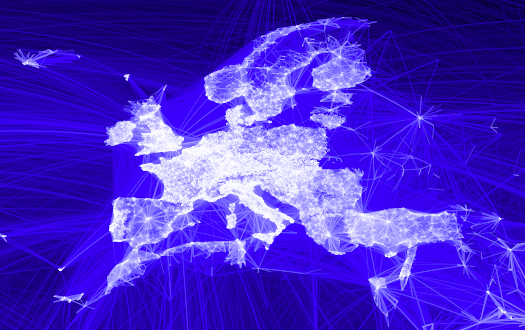
There is this beautiful graph created by the facebook intern Paul Butler showing all (?) connections between facebook accounts:

Paul’s article is called “Visualizing Friendships“, which I would more call “Visualizing connections between facebook accounts”, but that is probably a different matter.

Although this is a beautiful piece of artwork, from a statistical point of view it is not really giving us a great deal of insights. Sure, there are certain “white spots” on the map, where either there is a competitor of facebook more successful or people don’t want to, or can not use this kind of “social” contacts. Obvious examples are Russia or China. But this is info more on a meta level, i.e., not really part of the info shown.

What would be more interesting are things like a comparison between the expected link intensity based on either population, broadband connections or actual facebook accounts and the data Paul compiled. Looking at Germany, e.g., we see the former eastern part being less connected, which is based on both, smaller population density as well as a poorer development of broadband connections.

A visualization of these connection intensities should be hierarchic, starting with continents with the ability to drill down into countries, states and cities. That would certainly mean some development and could not be done in R (yes, this map was created in R!) so easily – maybe a case for iplots.

Sharpen your Eyes

We definitely live in a world of overflowing information – certainly more than a human can and wants to digest. Of course, the internet is the principal motor for this, but it also happens with the design of simple everyday’s things.

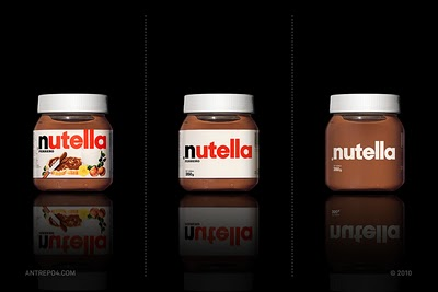
Antrepo has a nice example of how product designs can be reduced to what is really unique to it. Here is the example of my daughter’s favorite spread:

How things usually work (and that is the other way round, i.e., from clean to cluttered) can be seen in this great video on youtube:


What can we learn from this for creating better visualizations?
Visualizing information/data we always face the problem to reduce a bigger amount of information/data to an essential message. We will only succeed when we manage to focus on what is essential and do not fall for the next best attention grabber.

Merry Christmas and remember this post when
unboxing your presents on Christmas Eve

Soccer: Can Money buy a Good Team?

The German Bundesliga has its (very short) winter break after 17, i.e., half the games played. We all know – or at least would not disagree immediately – that good players will cost a team a fortune, and the more a team can invest, the better will be the result.

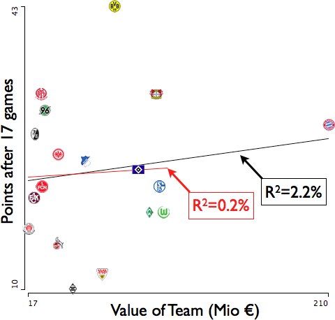
Using the (potential) value of the 18 German teams from www.transfertmarkt.de at the beginning of the 2010/11 season and the points achieved after 17 games, we get the following correlation:

The R^2 is at mere 2.2% for all teams and at vanishing 0.2% if we leave the outlier FC Bayern out (red line). The team managers will hate me for this, but money does not really make the day here.

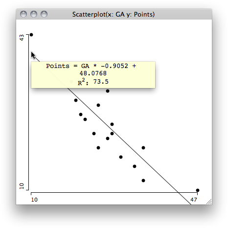
But fortunately there is the old rule that the goals against the team will make the difference. And indeed, the R^2 is at staggering 73.5% if we look at the scatterplot of Points vs. Goals Against:

(That regression doesn’t even change if we take “FC Bayern” out …)

Visualization makes Life Easier

I recently got my current Miles & More balance. As you might guess, I am not really a frequent flyer, at least not with Lufthansa and its allies.

According to the numbers, I need 36.000 miles resp. 30 flight segments to get Frequent Traveller status. Given my currently 1.500 miles resp. 4 segments, I am still 96% resp. 87% short to get this status.

The nice graph though, shows me that I am almost there ?!? Great!

Hoping that the Lufthansa pilots at least have a better sense of how far their destination still is … they probably trust their numbers 😉

Pretty Pictures [vs|and|or] Hard Models

It is a common theme when statisticians look at data visualization output – they ask for the model. Although I am usually not an unconditional friend of building models (especially before you understand the data), but I feel the need for some kind of model in order to make this visualization more than just a nice picture:

I found the chart on Junk Charts but it was initially published on Wired. Here is what I commented on Kaiser’s blog:

Kaiser,

I think you already phrased the most important issue: “no insights”.

From a statistical point of view we need to ask what model do we expect behind the data. Are all issues people are calling in for more or less equally distributed and only the intensity changes over time? This is certainly too simple, as we already know that people will complain about noise more likely during nighttime.

That will lead us to a model that has certain *expected* intensities of complaints for certain times over the course of one day, estimated from a larger period of time.

To get insights of what is going on on a particular day, we then would need to plot the differences between the “model day” and the actual data.

This difference is something I keep on preaching to business people: “Don’t be surprised by the data you look at, but be surprised by the deviation of that data from your expectation!” But for an expectation you need to have at least some kind of (naive) model …

Don’t get me wrong: there is a whole lot we already can learn from the raw data, but to be alerted regarding the unexpected would be the real insight, and that would definitely be a prefect showcase for an efficient use of graphics.

Off Topic(?)
Increased Internet Usage and Social Isolation

The study by the Stanford Institute for the Quantitative Study of Society (SIQSS) has its 10th anniversary now as I stumbled over a new study by the German ifo-Institut, looking into the same topic a decade later.

  • The SIQSS study states:
    – Internet isolates people
    – Internet allows work to intrude into home
    – Internet causes people to remain “home alone and anonymous”
  • The  ifo-study says:
    “Web-Nutzung hat keinen negativen Einfluss auf sogenannte Face-to-Face-, also persönliche Sozialkontakte (außer mit Verwandten: Web-Nutzer haben weniger Verwandtschafts-, aber mehr Bekanntschaftskontakte)”
    Using the web does not have a negative effect on so-called face-to-face, i.e., personal social contacts (except with relatives: web-user have less contacts with relatives, but more with acquaintances)

From a statistical point of view the studies are questionable anyways; the Stanford study does not reveal what was exactly done (beyond correlations/associations), and the ifo-study shows loads of significant terms of a linear model of very questionable stability. The former are social scientists the latter economists.

That somehow predefines the results. Social scientists will look critical on the changes the internet brings with it whereas economists must praise modernism fueling revenues that pays their salaries.

My personal opinion (and observations) is closer to what the SIQSS study showed than to what the ifo-institue delivered. The studies are certainly based on different situations as the ifo-study looks into the internet world of Web 2.0 and the so called “social networks”, but nonetheless, while working “with” the internet, we do not really interact with humans – ask my kids …

Stat Computing Visions from the Past

I recently stumbled upon an old paper of a presentation I gave at the Interface conference in 1998, entitled “JAVA – the next Generation of Statistical Computing?”:

It is very interesting to compare the things I envisioned 12 years ago and what actually came true. Here are some topics:

  • Did Java change a whole lot (in statcomp)? No
  • Did anybody had an idea that S-Plus would be flattened by R? No, although “the 2 Rs” did announce the “going public” of R at the very same conference …
  • Did a package based system become a success in statcomp? Yes, with R and not with Java as I would have thought 12 years ago.
  • Do we have data in the “network”? Yes, but now we call it “the cloud”
  • Did Java help to get better interfaces for statistical tools? No, not really. Most of them are as bad as they used to be 12 years ago.
  • Do we do statistics “within the browser” by now? No, neither with applets nor with other technologies at hand today. Yes, there are things like Many Eyes, but they can’t be used to actually analyze data.

What did you think what statcomp would look in the future 12 years ago? Should we be happy or should we be disappointed?

PS: Yes, I stole the idea of the paper thumbnail from Robert’s eagereyes – but I am confident he won’t mind …

Ranks or … whatever

The last Good & Bad post already dealt with using ranks and certain related problems, but the thing Udo pointed me to is really of extraordinary absurdity.

The Daily Mail has a feature about the most popular names:

The problem is already explained in the footnote such that I don’t need to comment any further – who would ever consider publishing statistics like this?

Even better is the list of the most powerful people in Forbes:

According to Forbes, the list is created along four dimensions:

  1. “First, we asked if a person has influence over a lot of people?”
  2. “Second, we checked to see if they have significant financial resources relative to their peers”
  3. “Then we determined if they were powerful in multiple spheres”
  4. “Finally, we insisted that they actively wield their power”

Now, just find a way to measure these dimensions – which is quite subjective for at least 3. and 4., but already hard for 2. . Then define some weights for the four dimensions, and finally make an (arbitrary) selection of candidates: almost anything goes!

PS: If we do not include variant spellings for ‘Mohammed’ the name would end up on rank 16 …

datajournalism – seriously?

There is an impressive 54 minute documentary on “visualization in the media” at datajournalism.stanford.edu.

The site also has quite a bit additional material literally around the video. The story seems to be tailored around (or at least crosses it every now and then) the paper by Segel and Heer.

Here are some significant quotes (with some picky comments from myself)

_______________ I Introduction _______________

We are interested in democratizing visualization

I am not sure what that really means. Giving access to a very limited set of visualizations might generate 99% chart junk and a few good things – whom did it help in the end?


The best way for people to learn about visualizations is to make them

That is certainly the case for us experts, but don’t we need basic training? You won’t tell a stats 101 student “the best way to learn about statistical models is to create them; download R and be happy!”, would you?


This is looking at air traffic over North America

Hey, come on. This one is such an old hat (see here). Of course we have faster computers and better rendering machines, but what is the conceptual contribution in the year 2010?


_______________ II Data Vis in Journalism _______________

… what visualization is helpful for is putting data into context

Nothing to add here.


… how do you get a story from the data?

That should be an easy one for the media, as they start with the story.


… look very nice, and are almost completely incomprehensible.

It is indeed very tempting to create very pretty pictures, where the practical value (i.e., the interpretation from the visualization without knowing the story beforehand is very limited)


_______________ III Telling “Data Stories” _______________

Here is the data, and you can play with it as you want…

This is a dangerous one. There are certainly visualizations where the reader might positively use some degrees of freedom to manipulate and explore, but too many examples show that the reader is just left alone poking in a pile of data.


_______________ IV A New Era in Infographics _______________

Unfortunately Infographics is something that is dominated by fashion …

Well, to be a good data visualizer, you need to be some sort of artist – as beauty helps. With artists’ attitude, there comes vanity and fashion. As long as this happens for people rooted in a quantitative education, I think we are safe – if not …


… some of the people doing it like rock stars!

That sounds similar as to the fashion trends, but I think is is even worse. Rock stars aim at publicity – with all means.


_______________ V Life as a Data Stream _______________

… in a future we are heading to, there are sensors everywhere …

I am not looking forward to being part of this future …


_______________ VI Exploring Data _______________

The key part of exploratory data analysis for many instances is being able to rapidly iterate …

This is where the toolkits separate from “closed”, general purpose tools. With a toolkit you are still very close to programming – and that takes time. More “complete” tools may be able to get you up and running far faster, though with limitations.


_______________ VII Technologies and Tools _______________

… in many ways of how much a software development shop we’ve become …

This is a crucial point. Often the creativity and the technical skills won’t meet in one person. But this is a common problem for all types of software and often culminates in the problems of synchronizing the developer’s and user’s views.


In the end, I am not surprised that the tools for Exploratory Data Analysis (Apps for EDA) listed are all from the computer science based InfoVis domain, and nothing from statistics. Needless to mention that Tableau is based on Lee Wilkinson’s book Grammar of Graphics:

(One question is left though: what makes Martin Wattenberg smile so persistently?)
Finding Outliers in Outliers?

Presenting at the Dutch Chemometrics Society annual meeting late May this year, I heard a talk of Klaas Faber on the “Athletes Biological Passport” – especially targeting the Pechstein case. Now that the Swiss court finally confirms the ruling, things popped up again. Faber, being the expert of Pechstein, talks about “torture the data until they confess”.

Regardless of Pechstein being guilty or not, there are some problems with the passport from the statistical point of view.

The two major problems with the passport which I remember from Faber’s talk are:

  1. The sample from which the confidence intervals are created is based on ordinary people, or at least average sports men. This is certainly due to the fact that we need a large enough sample, but is it representative for the few top athletes – doped or not?
  2. Assuming the confidence intervals are created for sportsmen who did not use illegal methods to enhance their performance, we a-priori know that we mistakenly will convict x% clean sportsmen given the (100-x)% interval.

Not only as a statistician I have a problem with the above mentioned points, as statistics is used to convict someone merely by the fact that he/she is off the limits with his/her biological measurements, without any causal connection proven that these values are caused by doping.

Let me finish with a simple example of a sample of a normal distribution of size 100,000 illustrating the dilemma. Plotted in a boxplot, we get the following:

What is marked as “outlier” by the boxplot is, for most cases, not any different from the adjacent values at the whiskers. Getting more and more to the fringes, we might find that some values really “look like” outliers. For this sample we would “convict” 763 cases according to the boxplot definition, although all come from a “perfect” normal distribution.

In the end, much seems to be determined by the credibility of the different sports associations. Very much points to a doping case for Contador, but the UCI seems to cover up for him – the ISU did the opposite for Pechstein.

The Wall! What Wall?

Stephen Few posted this illustration of the typical BI process on his site:

I largely agree with Stephen on the different steps, which are very similar to any kind of data analysis process (you will probably leave out the “integrate”, “store” and “report” step in a non-BI / non-datawarehouse environment).

But there is one crucial point lacking in this illustration. Once you start to explore the data, the whole thing stops to be linear but gets to be very iterative, jumping over the wall every now and then. I.e., you may find out that the data cleaning is insufficient, or the model you have in mind needs some other transformation of the data, or you might want to collect additional or other data altogether.

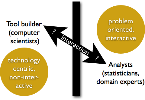
The wall does exist, but I think it is more separating two kinds of people / thinking:

The solution to the problem Stephen addresses is from my point of view that analysts and tool builder need to work together more closely regarding tool development, rather than leaving it to the marketing departments what the next release will look like.

One thing is for sure: we won’t succeed if analysts continue to build useful but technically insufficient tools and computer scientists still build fancy tools that merely help the analysts.

WIREs Computational Statistics

WILEY’s Interdisciplinary Reviews are positioned as “WIREs publications focus on high-profile research areas at the interfaces of the traditional disciplines.”

Currently there are six areas covered

  • Climate Change
  • Cognitive Science
  • Computational Statistics
  • Nanomedicine and Nanobiotechnology
  • RNA
  • Systems Biology and Medicine

and five other fields (including Data Mining and Knowledge Discovery) upcoming in 2011 and 2012. The compstat part is growing at a good pace and the cleanness and conciseness of the articles along with the visually appealing layout makes the articles fun to read.

Although one might argue that there are other authors with better expertise on the one or the other topic, we should not forget the effort it takes to get this together!

Here are links to two of my contributions

  1. Mondrian
  2. Brushing

(I feel confident to be the right author for the first article 😉 –  access is free for now, so you may want to save a copy of the one or the other article for your next seminar or just for reference)