Parallel Sets vs. Mosaic Plots (Take I)
Robert has released the wonderful parallel sets tool in version 2. It is JAVA, it is interactive – so what do we want more! As I spent some time thinking about the display of categorical data and creating tools for their visualization myself, I thought it would be a great idea to compare the parallel sets approach with mosaic plots and variants like fluctuation diagrams and multiple barcharts. I used the parallel sets tool and Mondrian to create the plots.
Now, when it comes to categorical data, there is no way to get around the
Titanic data
The most interesting feature to find in the Titanic data is the “woman and children first” policy. One oddity is the very small group of surviving male in 2nd class. This feature is queried in both plots.
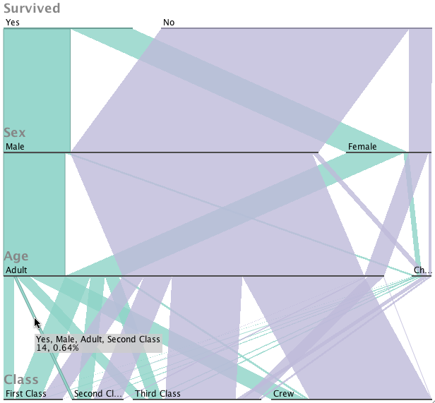
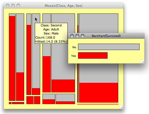
In both plots we see that there is something wrong with the size of the group of surviving 2nd class males. The policy “woman and children first” though, I find hard to see in the parallel sets – this might be a problem of a better ordering of the axes in the parallel sets view.
Detergent Data
One strength of mosaic plots is to show the degree of an association. The detergent data is a very good example to illustrate this. Let’s see how the two visualizations compare:
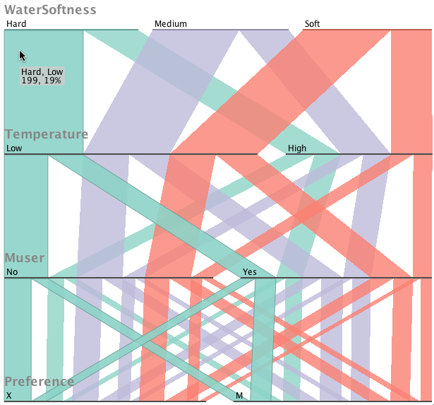
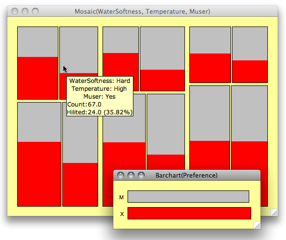
Whereas the stronger association between “Preference” and “M-User” is fairly obvious towards harder water and higher temperatures in the mosaic plot, I just see a (nice) regular pattern in the parallel sets.
Census Data
We finally want to look at a type of data where I know that mosaic plots usually have a hard time to deliver decent results and it is usually better to use multiple barcharts or fluctuation diagrams instead
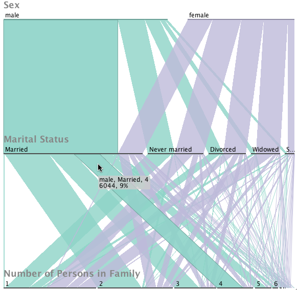
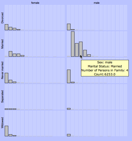
I left out the standard mosaic plot altogether as it fails completely to give any information that can be interpreted. Censored zooming is incredible useful here.
I don’t want to summarize by now as I still need to learn more about parallel sets (which, btw are the same what Matt called hammock plots before).
Looking forward to your comments – which will hopefully lead to take II.
These examples display reference material jammed into a graphic that in itself makes no particular point. The designers have created a puzzle not a ‘solution’. While numeric riddles may be useful in newspapers or magazines, they are generally a barrier to communication. Why not just leave reference data in a reference table?
Although untrendy the humble table has proved to be a reliable, robust and readable structure for presenting data for the past 3,000 years. An old phrase flies into mind: “The emperor has no clothes”. Or perhaps I am being too harsh?