Sharpen your Eyes
We definitely live in a world of overflowing information – certainly more than a human can and wants to digest. Of course, the internet is the principal motor for this, but it also happens with the design of simple everyday’s things.
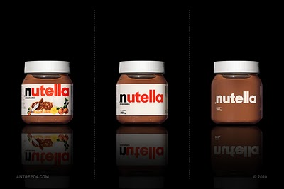
Antrepo has a nice example of how product designs can be reduced to what is really unique to it. Here is the example of my daughter’s favorite spread:

How things usually work (and that is the other way round, i.e., from clean to cluttered) can be seen in this great video on youtube:
unboxing your presents on Christmas Eve


