Soccer Visualization for the World Cup
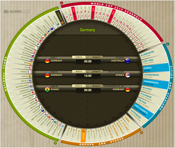
Special times fuel the development in specific areas. E.g., during WWII a lot of (sometimes curios) inventions and technical optimizations came up – usually not supporting humanity. The Soccer World Cup seems to spur the development of soccer visualizations and sports visualizations in general. My favorite (and apparently not only mine) one is this overview:
Querying places, teams, groups and dates highlights all associated information in the other dimensions. Selecting the “marginal distributions” (at the arrows) shows calendars, match schedules and maps – neat!
Infosthetics lists some more visualizations which even show live updated soccer statistics. Although I don’t believe much in this kind of statistics like – every game on a Sunday when Lionel Messi was wearing blue socks was won by Argentina with one goal by Messi – I guess it is fun to watch the live updating of the objective soccer statistics and comparing it to the subjective observation of the game and trying to find out how this matches up and probably might explain why a team wins or not.
Enjoy the World Cup!
Hi, Martin, this work by Marca newspaper is really outstanding. I leave here a couple of other suggestions:
Visual Loop (http://visualoop.tumblr.com/), a non-stop stream of infographics and other forms of data-visualization.
Inspired Magazine’s take on infographics about the World Cup (http://www.inspiredm.com/2010/06/06/2010-world-cup/)
Keep up the great Work!