The Costs of Exaggeration …
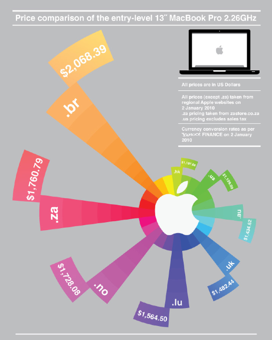
On an Apple related list I found a pointer to this price comparison chart. Although the author already put a disclaimer in his post that this graph was not intended to be “mathematically correct”, it is amazing how badly the actually information is hidden behind the rainbow chart.
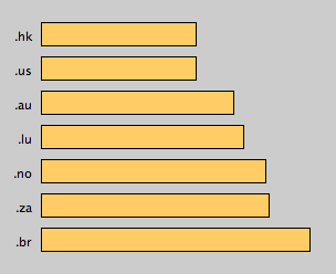
Using a simple barchart just does not deliver any dramatic story at all, but hey, if prices are almost identical in Hong Kong and the US, please don’t show a difference. Here is the less appealing, but faithful chart:
Not to mention all the problems of adding the correct taxes, which are not really solved for these prices …
