The Good & the Bad [11/2005]
Yes, it has been a while since I posted a “Good & Bad” …
But as I saw this “novel decision tree plot” on an advertisement by C&H for Paul’s R Graphics book, I got inspired again …
Now here is “The Bad”:
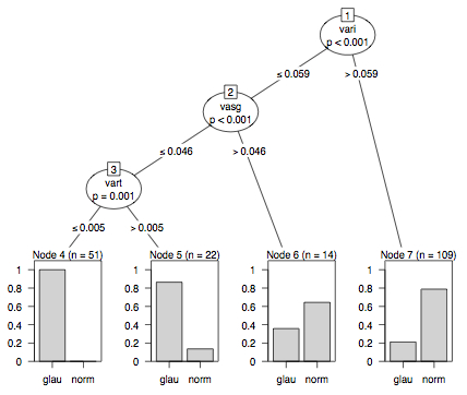
Let me explain, what went wrong with the R graphics:
- A tree, which is just a special graph, consists of nodes and edges
A full featured barchart in a leaf is certainly a doubtfull glyph for a leaf/node! - The size of the nodes must be read as text …
- Side by side barcharts are among the weaker representations to display a proportion
- The numbering of the nodes is non-standard and does not help reading the information
- Now think of a tree with, say, 10 inner nodes and 11 leaves! How big must the plotting device be to display so much (overhead) information?
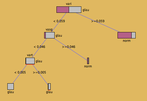
… and here is “The Good” (from Simon Urbanek’s KLIMT)
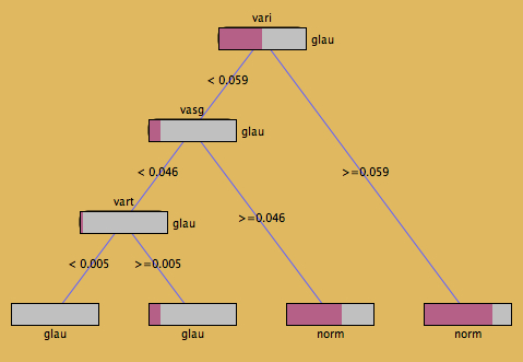
This representation is much clearer. Not to overstress Tufte, but the data-ink-ratio in the KLIMT plot is hard to beat!
I personally would prefer the next display (which only takes two key-strokes to change from the first plot!), which puts leaves on the “correct” level and has proportionally sized nodes.
