The Good & the Bad [5/2005]
The Bad of the month May is from a talk by Kurt Hornik given at the compstat 2004 meeting in Prague. It looks like follows:
This is the famous barley data used in Bill Cleveland’s Visualizing Data many times.
Well, on a first view we would say it looks good …
Here is what went wrong with this graphic:
- Never use areas to display continuous variables. Continuous values should be plotted along an axis as points or other sensible glyphs.
- Use stacked barcharts only for proportions, that add up to a fixed amount (say 100%). Put the least varying class at the bottom of the stack, the more varying clases at the top.
- Avoid ”scale hopping”, i.e. the things that should be compared must be plotted along ONE scale.
(Not to mention that the legend messes up the colors …)
Can you see anything ‘out of line’ in the data?
Using the same lattice package in R, we can do much better. Here is the Good:
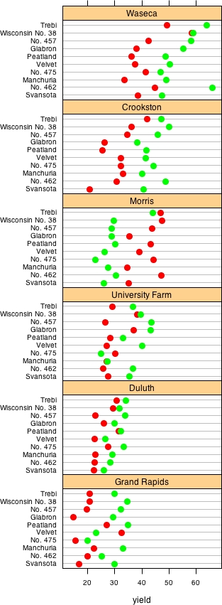
Now we use points, and only have one scale for the whole plot … and, aha! Somethings wrong with the field in Morris.
But talking about this feature and talking about statistical graphics, there is only one very simple and long known plot to display the feature in the data: the Interaction Plot.

The feature we spotted in the data is nothing else than an interaction of the factor year for the site Morris, which is mostly related to a transcription error.
Going from the first to the third plot, we more and more focus on the ‘right’ information, and need less ink to draw it, which nicely corresponds to Tufte’s data/ink ratio.
Obviously, boxplots are another good choice for visualize this kind of data.


This post is great! I just went through the entire archives to find it. The interaction plot tells the story so much more clearly than Cleveland’s dotplots. I’m surprised that it didn’t occur to him, or to me as I read his book. The interaction plot however maybe makes it harder what Cleveland considers the key point: the equal magnitude of the difference between years, swapped for Morris.