Titanic Disaster: Visualization Insights 100 years later
Today is the 100th anniversary of the Titanic disaster and it is all over in the media – ranging from movies to serious reportage. Having worked on visualization of categorical data visualization for a long time, the Titanic data became somewhat like “the mother of all demo datasets” and may be boring people by now as much as the Iris dataset does for multivariate analyses.
Nonetheless, there are two issues (which can be found in past posts on this blog), which summarize the most important facts on how the disaster was handled:
1. “Women and Children first!“
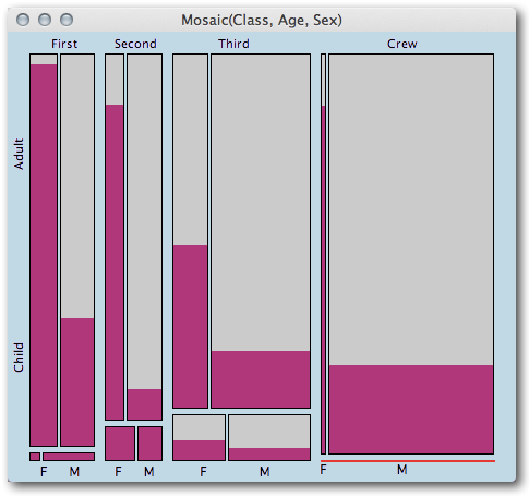 (each rectangle shows a combination of Class x Age x Sex) and
the proportion of survived passengers via highlighting)
2. Travelling 1st Class makes it easier to get into a life boat …
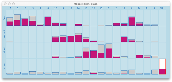 (Launch sequence of life boats – woman highlighted)
The shocking result of this visualization is that the first 6 boats were exclusively used for 1st class passengers (although boat No. 1 was not filled at all), and it took another 4 boats until 3rd class passengers were considered to be saved. Starting with the 15th life boat, chaos spread, and the last three boats went afloat almost empty.
Looking at the two visualizations, shows clearly what fuels the stories (not only) in the Titanic movies. 2nd class males are among those with the lowest survival rate, indicating a very heroic attitude. The boat filling strategy shows a strong social bias, which can only partly be excused by the coincidence of passengers locations and boat locations.
(Here is the data on the passengers and boats used for the visualization)

Here’s my take on the first one of those charts – http://jane.dallaway.com/titanic-data-weaving-weaving-project-14 – I made a hand-woven bookmark version of the same data
Great Mosaic visualization!
Here goes a more detailed version that, of course, takes more time to grasp and does not look as good as in Mondrian! 🙂
http://www.icyousee.org/titanic.html