Tour de France 2014
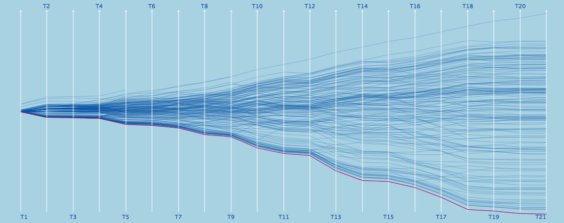
After the first 4 stages passed, I will start to log the results in the usual way as in 2005, 2006, 2007, 2008, 2009, 2010, 2011, 2012 and 2013 now:
STAGE 4: KITTEL to win his third stage, but still only rank 147
STAGE 5: Two ASTANA riders take the lead
STAGE 6: Yet another german victory, but NIBALI and FUGLSANG still in the lead
STAGE 7: A group of 42 already set apart 3 min, but the mountains are still to come
STAGE 8: After the first hills, KADRI wins and NIBALI can double his lead
STAGE 9: GERMANY got the 4th soccer world cup title – congratulations!
STAGE 10: NIBALI back in the lead with now almost 2:30
STAGE 11: As the classement does not change too much, let’s look at the dropouts
STAGE 12: GALLOPIN is the looser of the day – first mountains to come next stage
STAGE 13: After the first stage in the Alps, the top 16 spread 11’11”
STAGE 14: Anyone to stop NIBALI? Now 4’37” in the lead
STAGE 15: After a transfer stage, we may look at JI’s Chinese contribution …
STAGE 16: A group of 14 set apart, but can not endanger NIBALI’s lead
STAGE 17: MAJKA’s great second half of the tour is pushing him >100 ranks
STAGE 18: And yes, NIBALI wins again …
STAGE 19: NIBALI and JI are the “envelope” of the tour
STAGE 20: MARTIN flies to win the time trial – far from a podium finish in Paris
STAGE 21: Another victory for KITTEL, but we close with the trace of the winner!
Don’t miss the data 🙂


IS there a way to explore such visualizations interactively (either here on your site or somewhere else on the web ) ??
i.e. mousing over the lines to visualize different riders and/or selectiong n of them and comparing perrformances ?!?
Sure, just download the Mondrian data visualization tool (can be found on theusRus.de) and load the data, which is linked at the end of the post.
Then you can select, highlight and mouse over for queries etc.