Understanding Area Based Plots: Mosaic Plots
Mosaic Plots are the swiss army knife of categorical data displays. Whereas bar charts are stuck in their univariate limits, mosaic plots and their variants open up the powerful visualization of multivariate categorical data.
But let’s start with an introductory example. The Titanic data is still the most convincing application of mosaic plots, though many of us saw this example over and over again – I will show other examples as well once we are done with it.
 Above example starts with a simple bar chart of passengers by class at the top left, with all surviving passengers highlighted (I guess everybody is familiar with what happened to the Titanic …). The top right plot modifies the bar chart such that we can compare the highlighted proportions, i.e., the proportionality of width and height is interchanged, without changing the highlighting direction. We call this plot a spineplot.
With a spineplot, we are almost there for a 2-dim. mosaic plot, shown at the bottom of above graphic. Now we can derive the general building principle of a mosaic plot. We start with a blank rectangle and recursively split each tile according to the conditional distribution of the variable to add within that tile, e.g., we split the whole according to the distribution of class, and each class according to the second variable – in our case survived.
Leaving the survival information as highlighting, we can recursively split Class by Age and Gender and get the classical Titanic mosaic plot:

I guess it won’t take you long to find the “Women and Children first!” in the plot … (you might enjoy a video, that shows the above data visualization in action)
Now it is easy to see the fundamental difference to tree maps. Whereas in a tree map, we may split each node according to an individual criterion, the “tree” behind a mosaic plot is always fully balanced and the splits on a specific level are always according to the distribution of one fixed variable.
On the highest level, there are basically two general uses of mosaic plots.
- Conditional Distributions
Looking at a single response (like survival in the above example) or an interaction, conditioned on (or given a) set of variables (class x age x sex) - Structural properties of high-dim. categorical data
Often we need to understand the general structure of a high-dim. categorical datasets in terms of finding empty or very small combinations, the dominating classes, or trends and patterns in the data.
In this case we can make use of the numerous variations of mosaic plots (see, e.g., here for a Multiple Barchart), which mostly leave the strict area proportional constraint (which we need in 1.) and move to a matrix like layout (see Heike’s paper on more details, or try them out in Mondrian. See also Alex’s RMB-plots as latest contribution to this class of plots.)
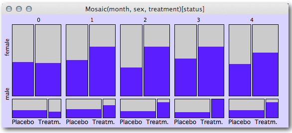
Let me give you two more examples of mosaic plots. The first is using longitudinal categorical data on respiratory diseases.

For five points in time we see the different development of the disease depending on gender and kind of treatment, with highlighted cases marking patients with a “good” status. We see the highest discrimination between the treatments for t(2) for female patients and t(3) for male patients, and a decreasing effect for t(4) for both genders.
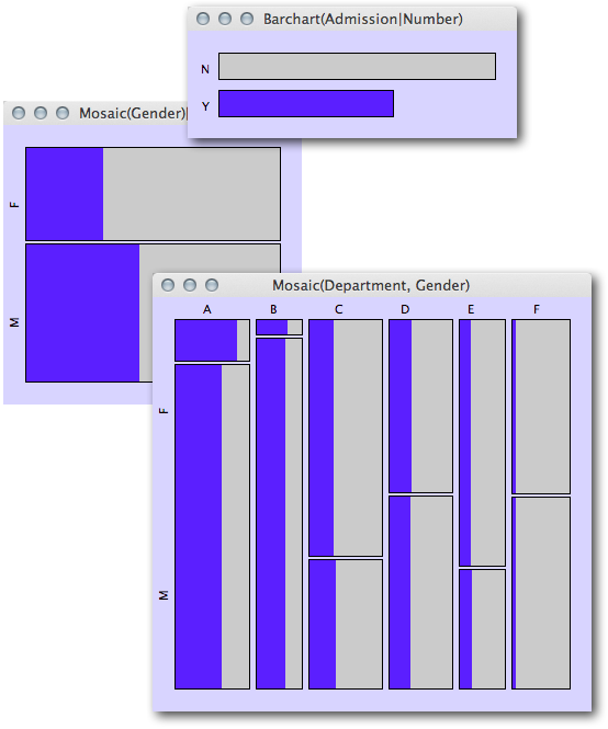
I will close with showing Simpson’s Paradox with the famous Berkeley admission data using mosaic plots:
 The mosaic plot of gender with admitted students highlighted (left) shows clearly that the proportion of females is smaller than the one of males. If we split up by department (lower right plot) the share of admitted students is almost completely balanced for departments B-F and even higher for females in department A.
I leave it to the reader to find a neat verbal explanation of what is going one here (as this post is already way too long …), but so much can be said: it has to do with the proportion of females and males within the different departments.


[…] to show-case. Some notes on notation, these go by various other names (including Marimekko and Mosaic), also see this developerworkds thread which says spineplot but is something a bit different. Cox […]
[…] Hay más al respecto sobre este tipo de gráficos aquí. […]
[…] multivariate categorical data, the mosaic plot (or Marimekko chart) is a powerful alternative. Personally, I think it’s easier to see the order […]
[…] I think you would do better to use a mosaic plot or a biplot from a correspondence analysis. I have an example of a mosaic plot in my answer to […]