The Good & the Bad [3/2011]
This post could as well be called “Which Smartphone is right for you?”, or “Plotting conditional distribution – but the right way!”. Here is the original visualization from Nielsen, which is not really bad, but still hides the important message to some extent.
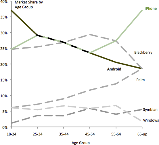
 Kaiser adequately pointed out that some features – important features – of the data are hard to spot in the Nielsen graphic. His improved version does not use areas any more, but shows the shares of the different OSs as lines over the age axis.

From this display we may conclude two things:
- Areas are unsuitable to display this kind of data
- We understand the data better when we condition on age instead of OS
(it somehow seems more natural that given a particular age, we might choose a certain phone and not vice versa)
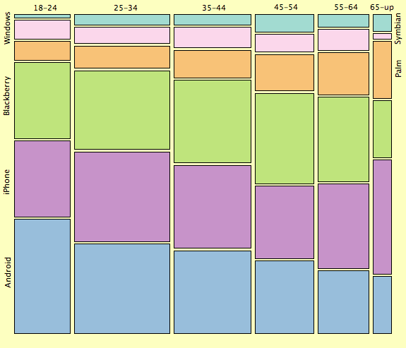
Thanks to Kaiser who shares the data on his blog, I was able to create the “rotated” mosaic plot, which also conditions on age but still uses the proportional areas.

We clearly see that not the areal 2-dimensional representation is the problem, but the conditioning was just chosen the wrong way. In this representation we also can retain the overall sizes of the groups, which is an advantage over the line plot.
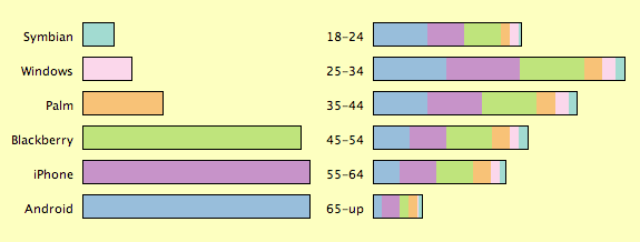
Things are even easier to interpret to with the marginals as legends:

From this mosaic plot we can perfectly read some of the features of the data:
- the popularity of Android phones decreases with age
(maybe because they are cheap and tailored towards tech-oriented people) - iPhones and Palms show an increasing popularity for ages above 55, and
(probably due to an interface more suited for “ordinary” people) - vice versa Windows and Blackberry are underrepresented for 55+
(maybe they are no longer being forced by their employers to use these phones)
(Graphs were made with Mondrian)


